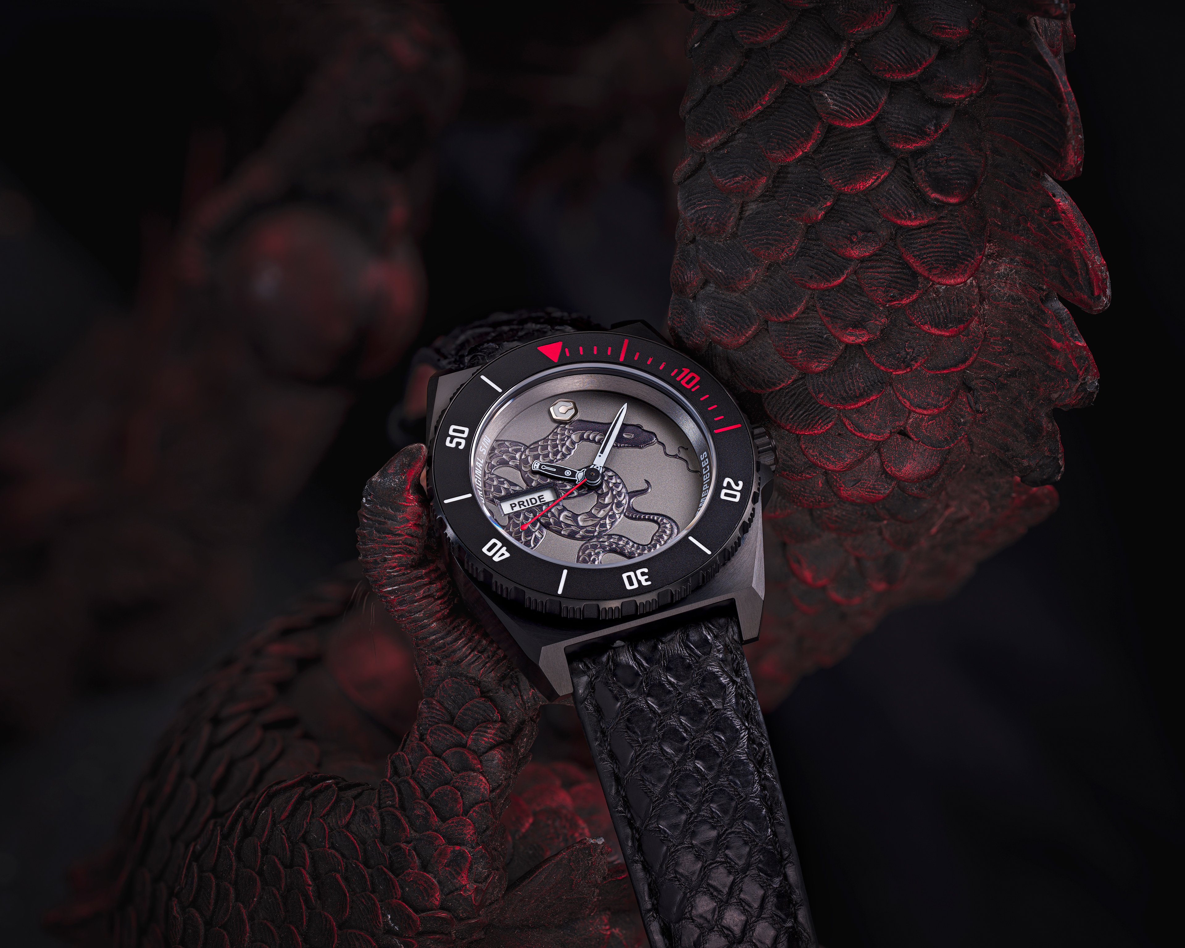
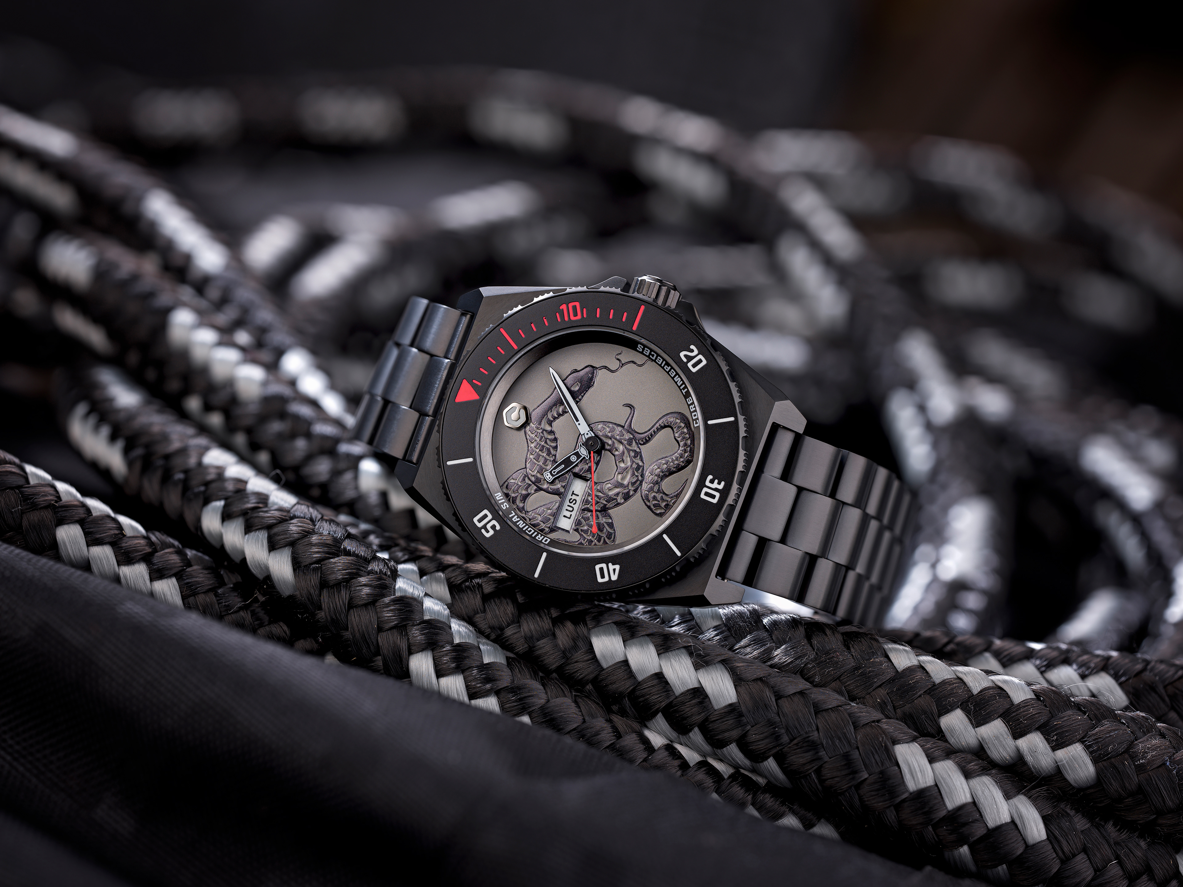
The development of the brand identity was a multi-step process designed to create a cohesive and remarkable identity that appealed to loyal customers and new audiences alike.
Discovery
Conducted in-depth research into market trends, competitor offerings, and customer behaviors.
Identified key insights about the target audience, including their aspirations, values, and lifestyle preferences.
Assessed Core Timepieces’ current perception in the market to understand strengths, weaknesses, and opportunities.
Defining Purpose
Articulated the brand’s purpose as more than just creating watches—positioning Core Timepieces as a storyteller of time, crafting bold, luxurious pieces that connect history, culture, and personal milestones.
Focused on evoking emotional resonance by blending artistry, craftsmanship, and functionality.
Voice
Defined a brand voice that is confident, edgy, and sophisticated, with a playful and occasionally irreverent tone.
Ensured the voice could adapt seamlessly across platforms, from social media and marketing campaigns to packaging and product descriptions, maintaining a consistent personality. It's all about the mood . . . So the Mood board booklet was paramount and evolved into their style bible.
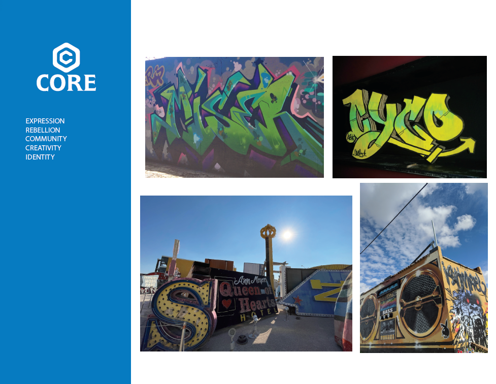
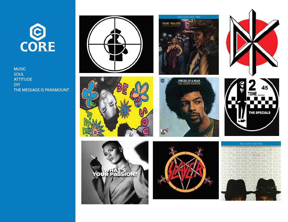
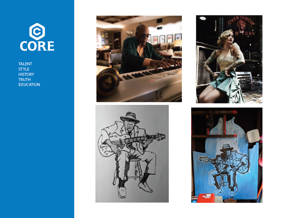
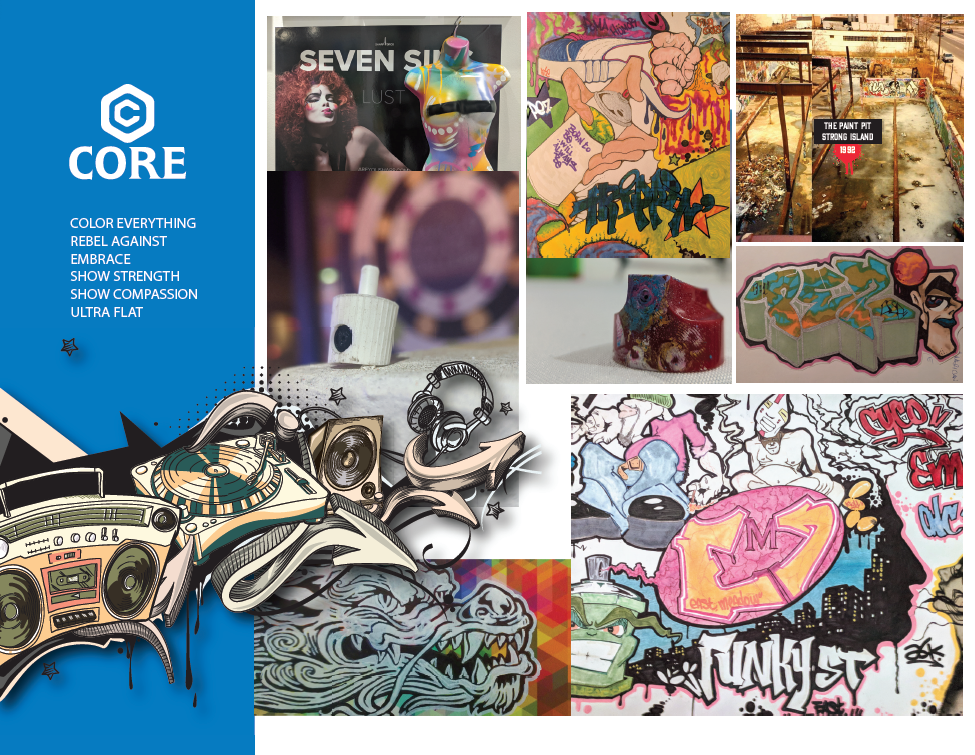
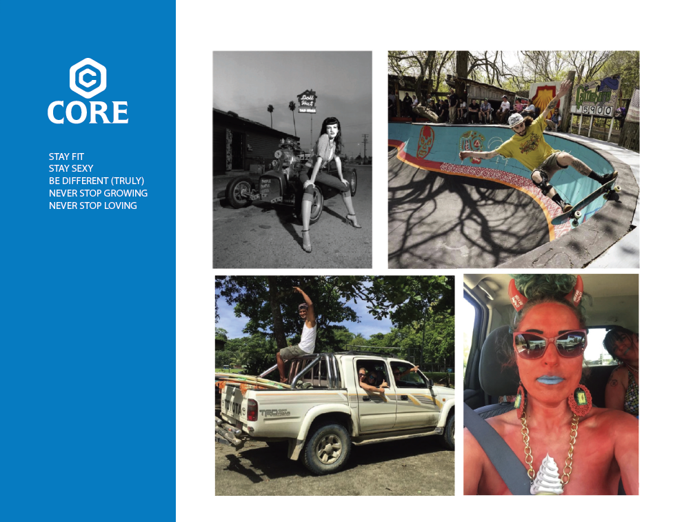
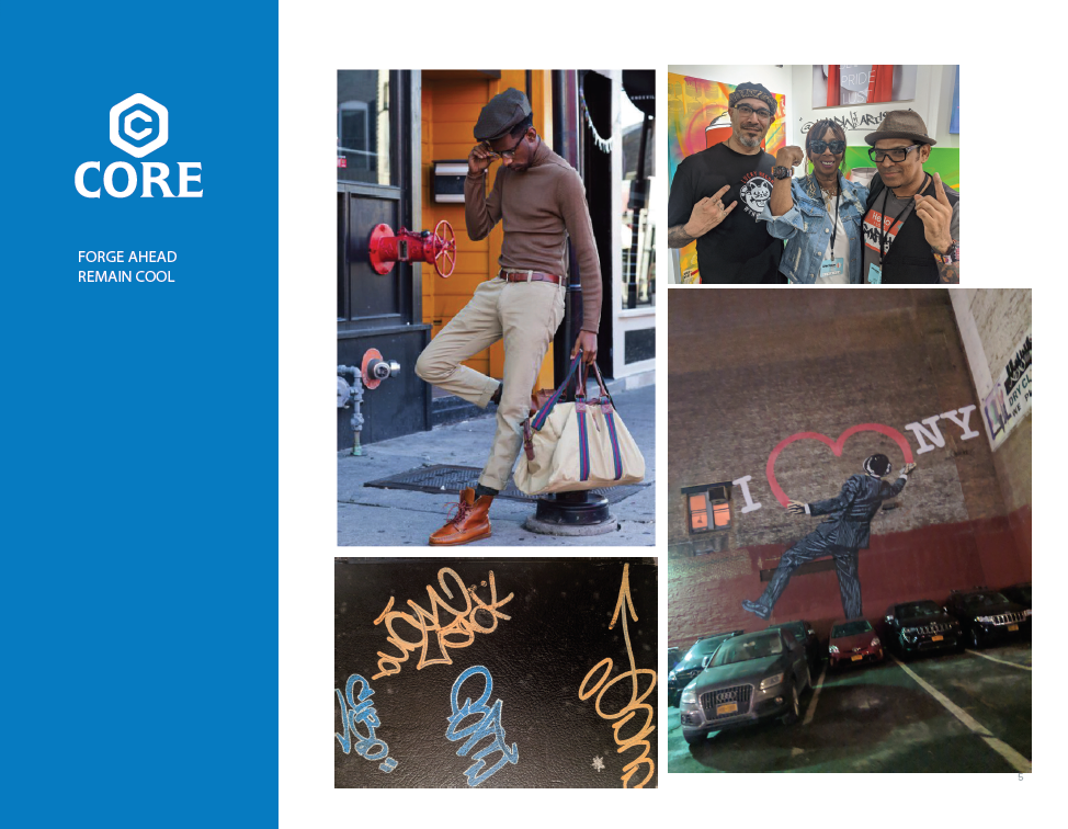
Tone = Attitude
Voice = Personality.
Voice = Personality.
The voice is their personality reflected in their writing. Their tone will create their writing style. It will affect their audience. Embracing them. In their messaging their tone should be clear, concise, confident, and courteous. Sophisticated, but not pretentious.
Positioning
Positioned the brand as a leader in “bold luxury,” emphasizing exclusivity, individuality, and a refined yet daring aesthetic.
Differentiated Core Timepieces by linking each product to a narrative, offering customers not just a watch, but a meaningful experience and cultural connection.
Brand Story
Crafted a compelling brand story that communicates the brand’s heritage, inspiration, and journey. This story resonated emotionally with the target audience.
Visual Identity
Logo: I was inspired by a ”core” value of being true to one's self and never compromising. A term I kept hearing in my head was "Be true to your core”. A value that the owners shared with me. The purest layer, thought, or idea is at the core of everything. A cube with many sides, messages, and views still has a single “core” idea.
Color Palette: Developed a palette inspired by the owner's story. Blue creates a sense of security while showing loyalty and professionalism. Though honestly Black and Blue is such a strong statement when they wanted to metaphorically destroy the competition. I'm not above clever puns.
Typography: Chose a typeface that was bold and blocky allowing the letterforms to speak for themselves to convey both modern sophistication and classic luxury.
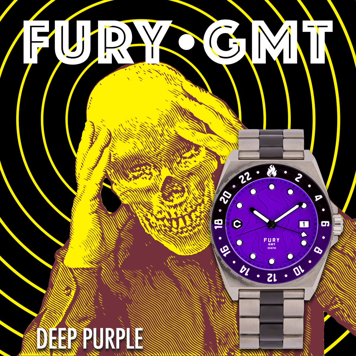
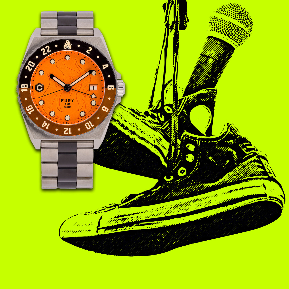
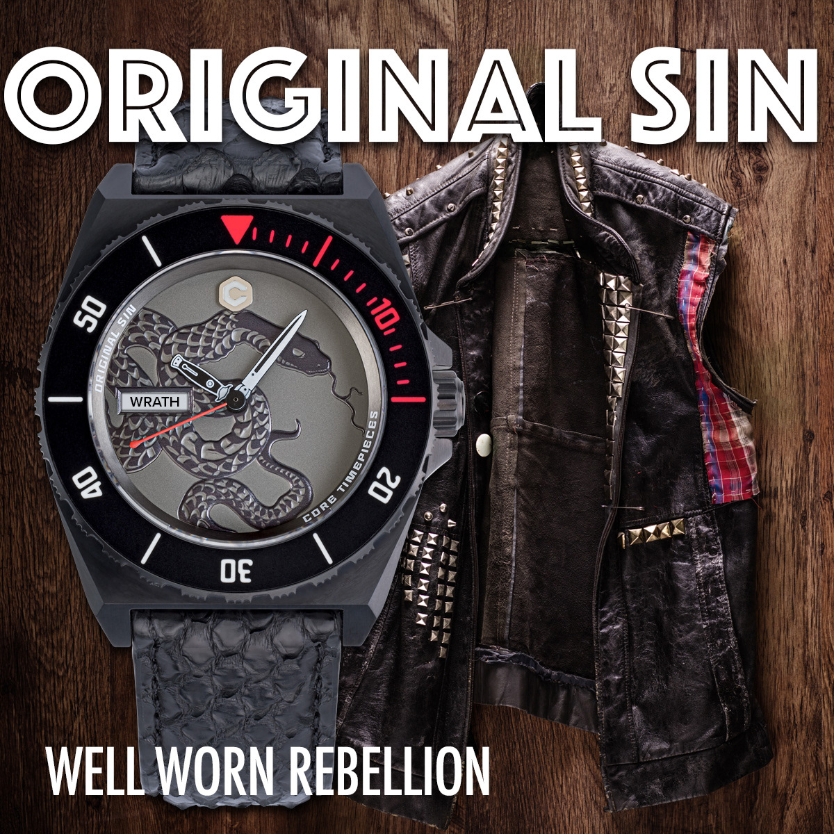
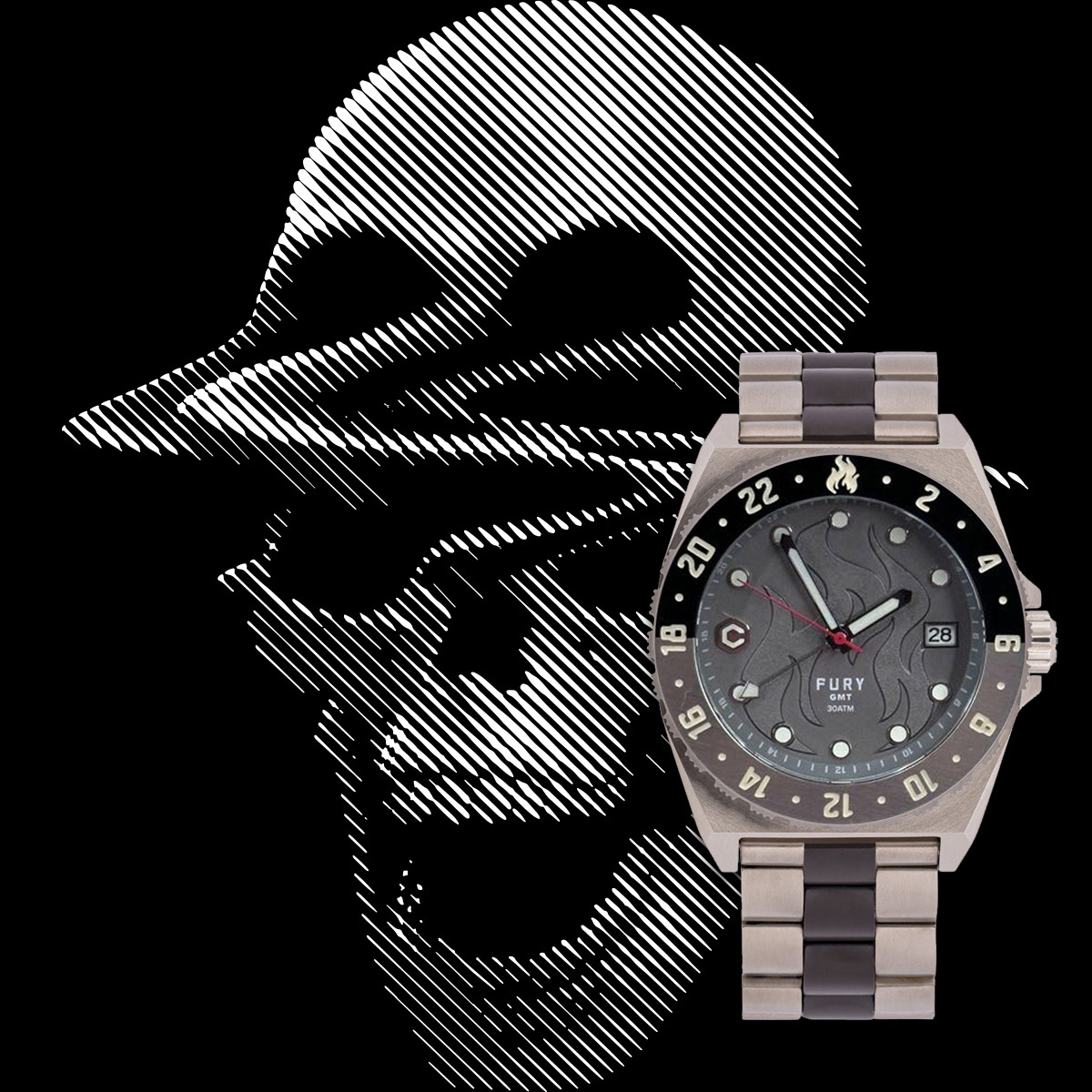
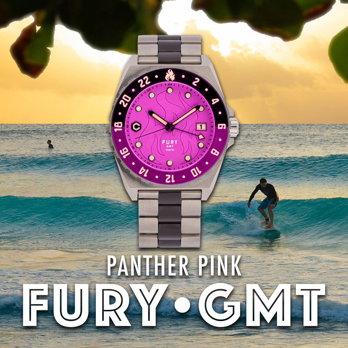
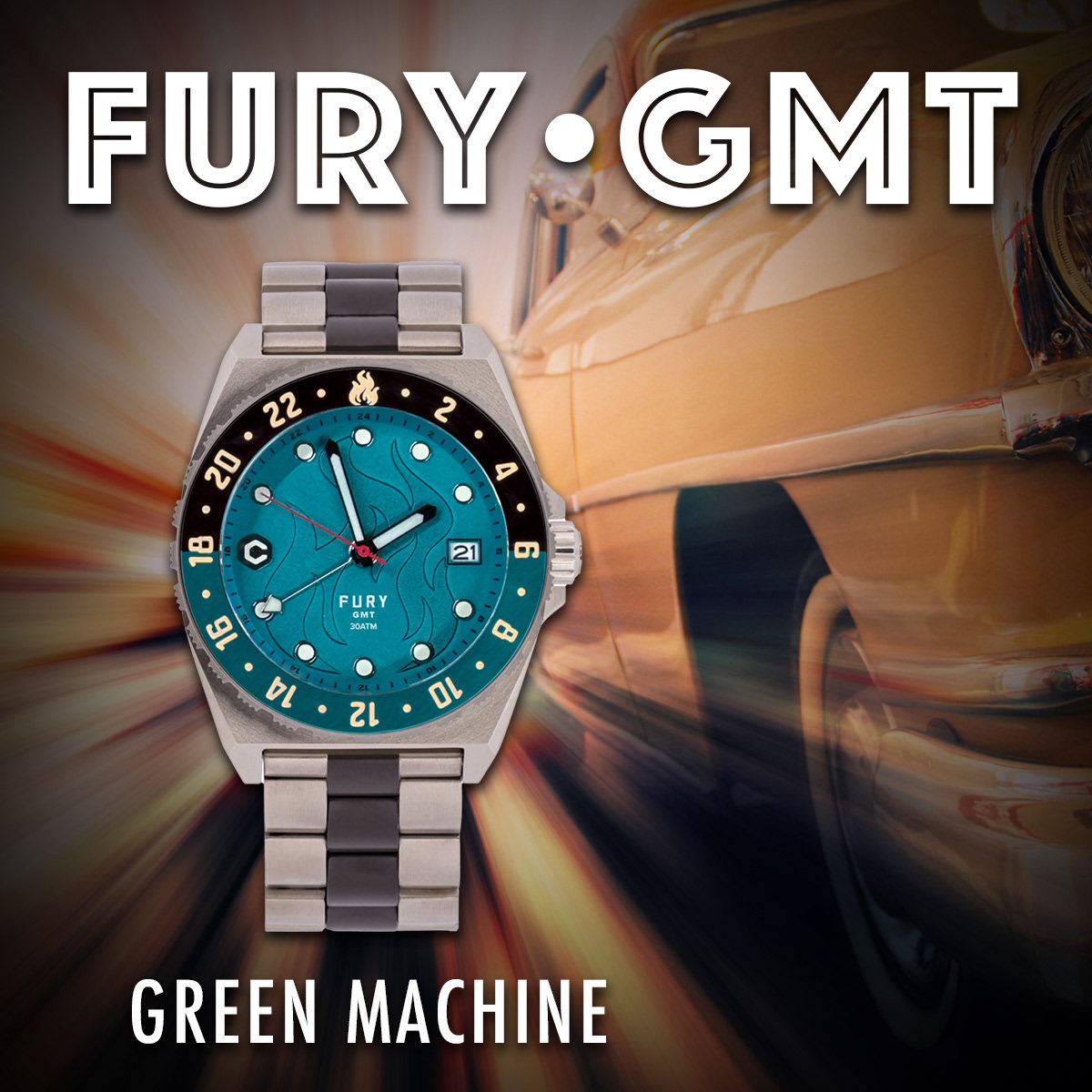
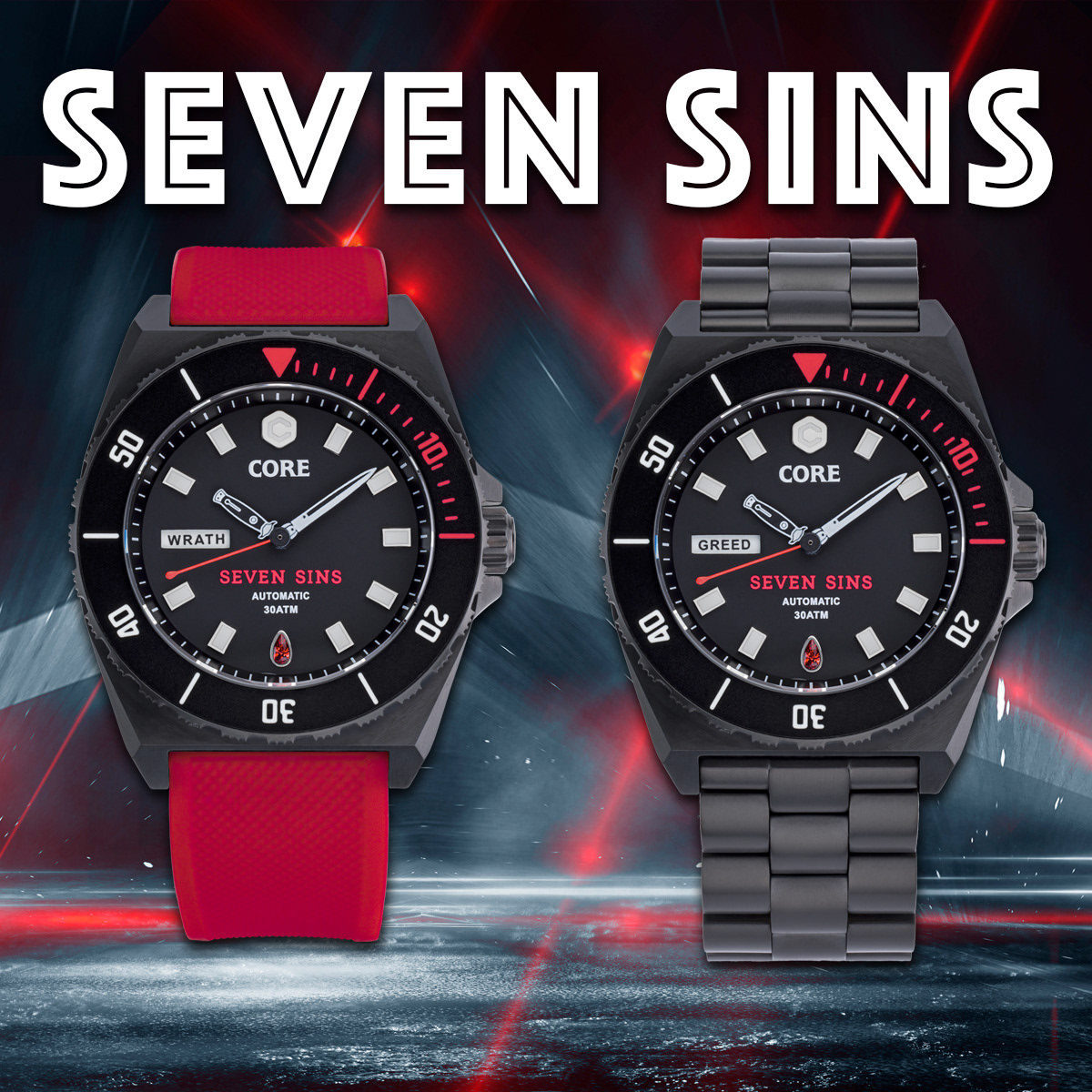
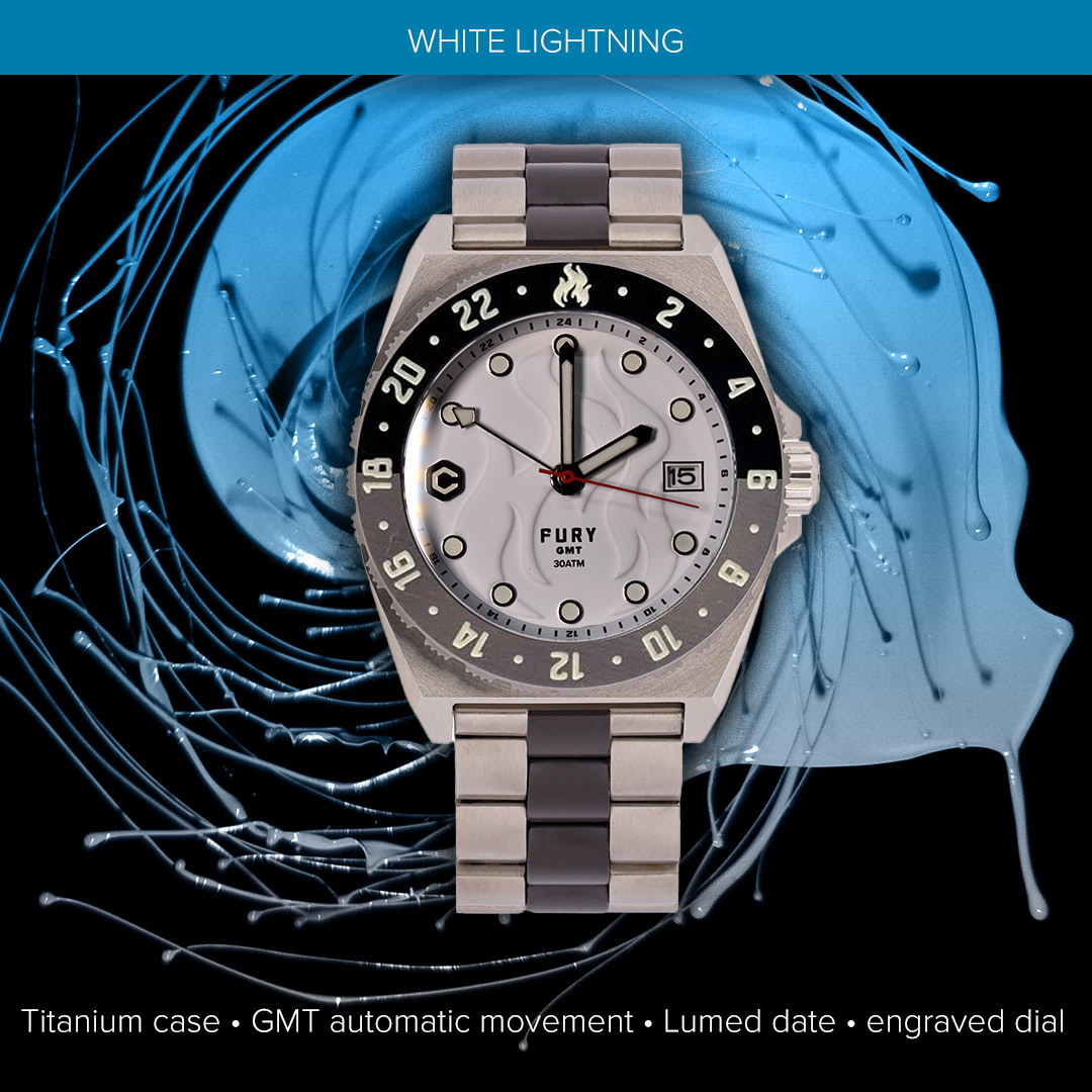
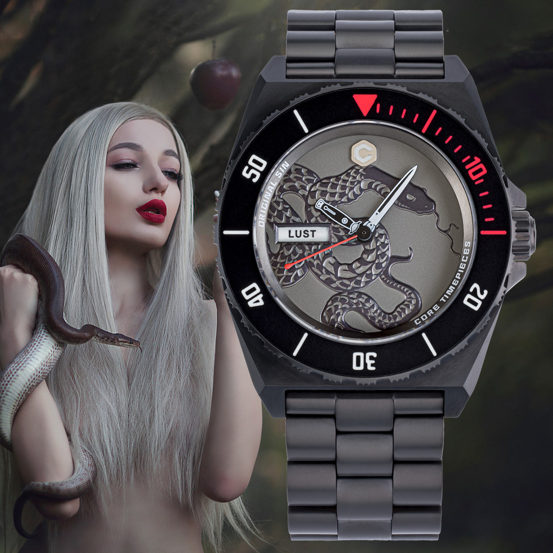
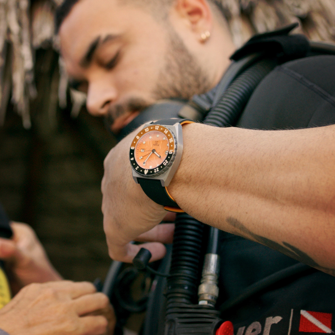
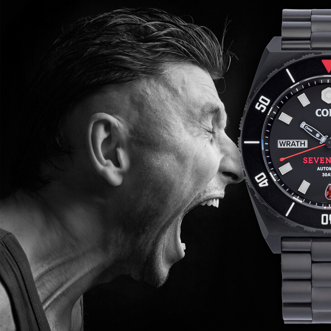
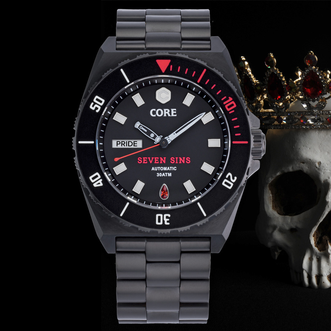
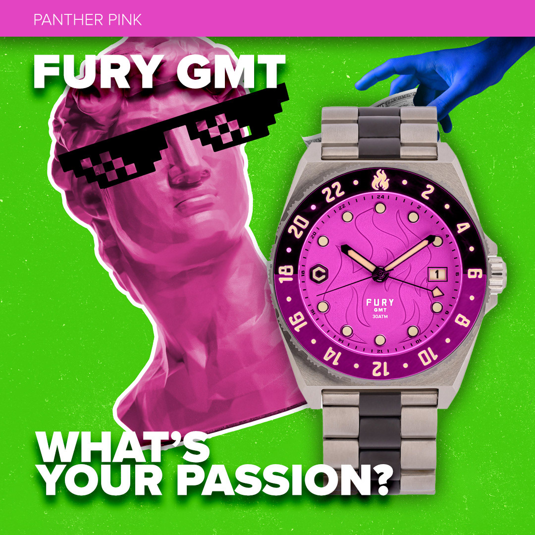
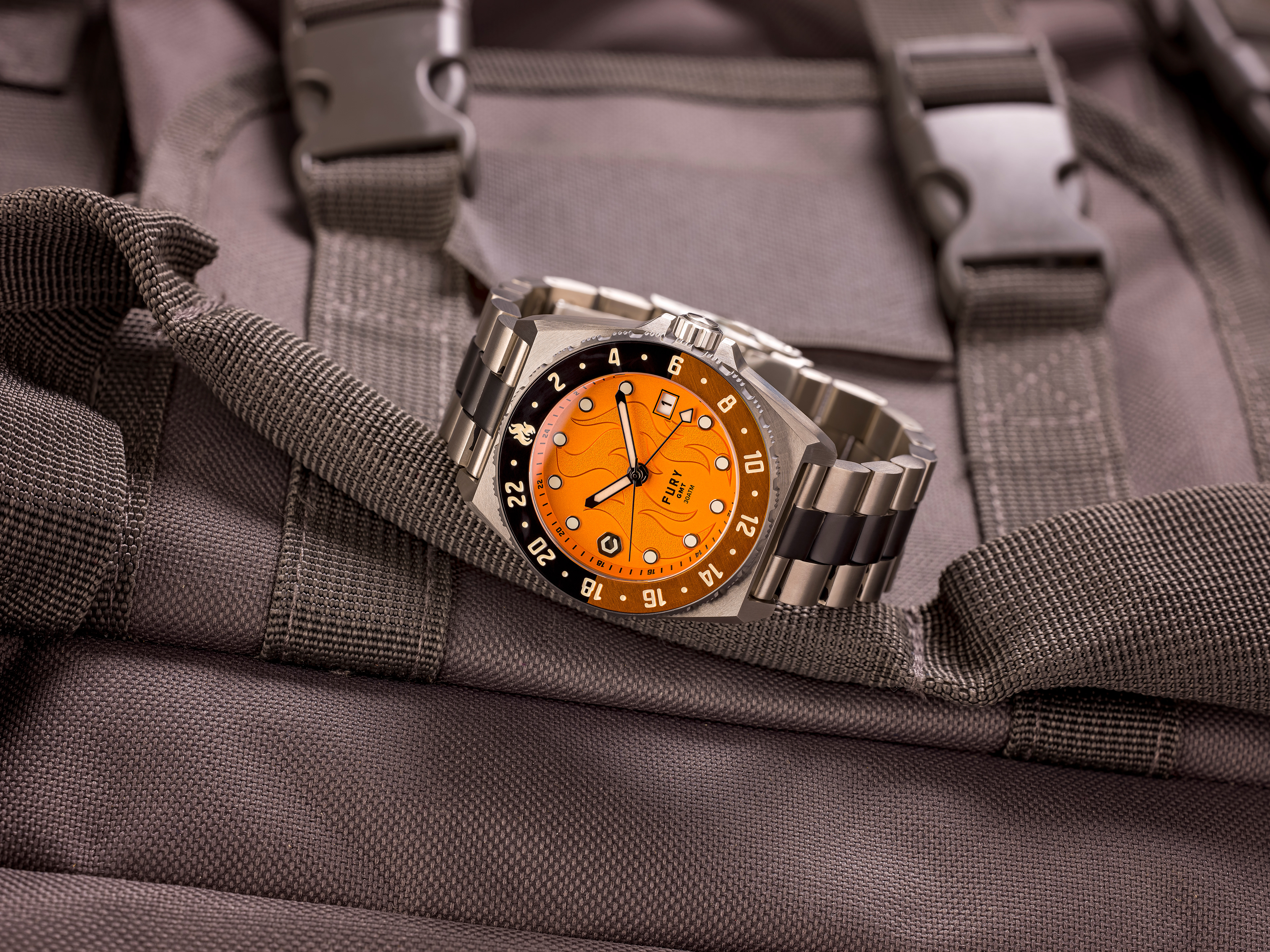
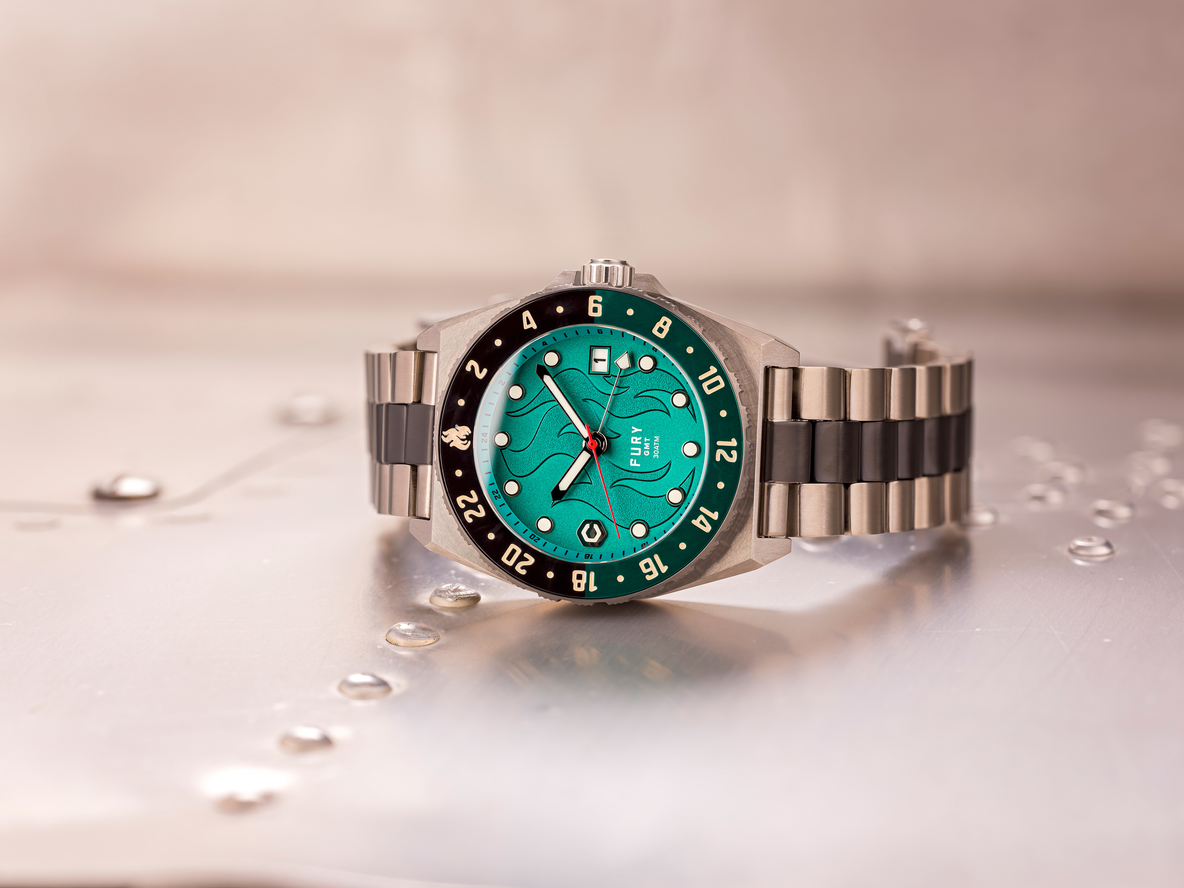
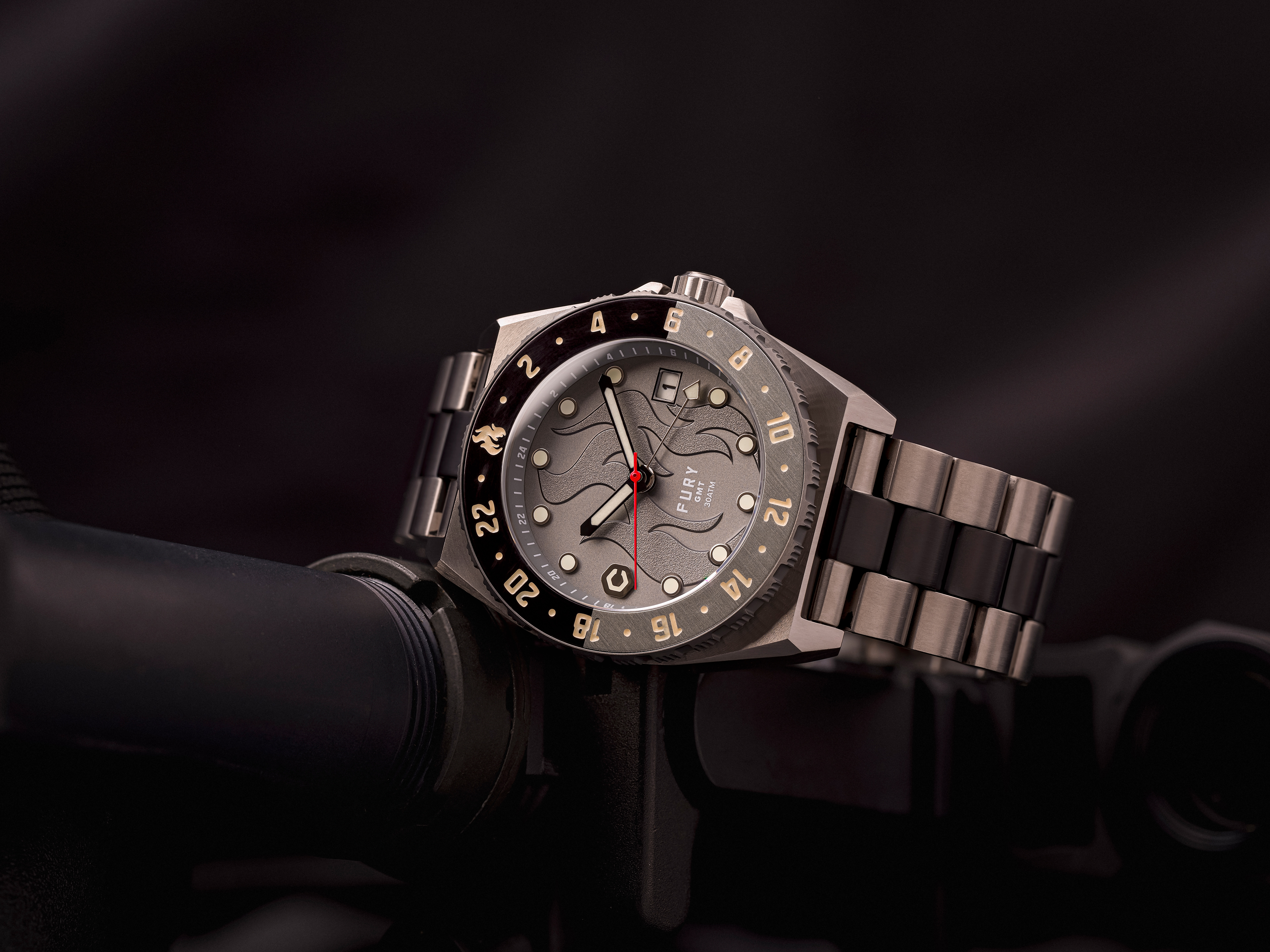
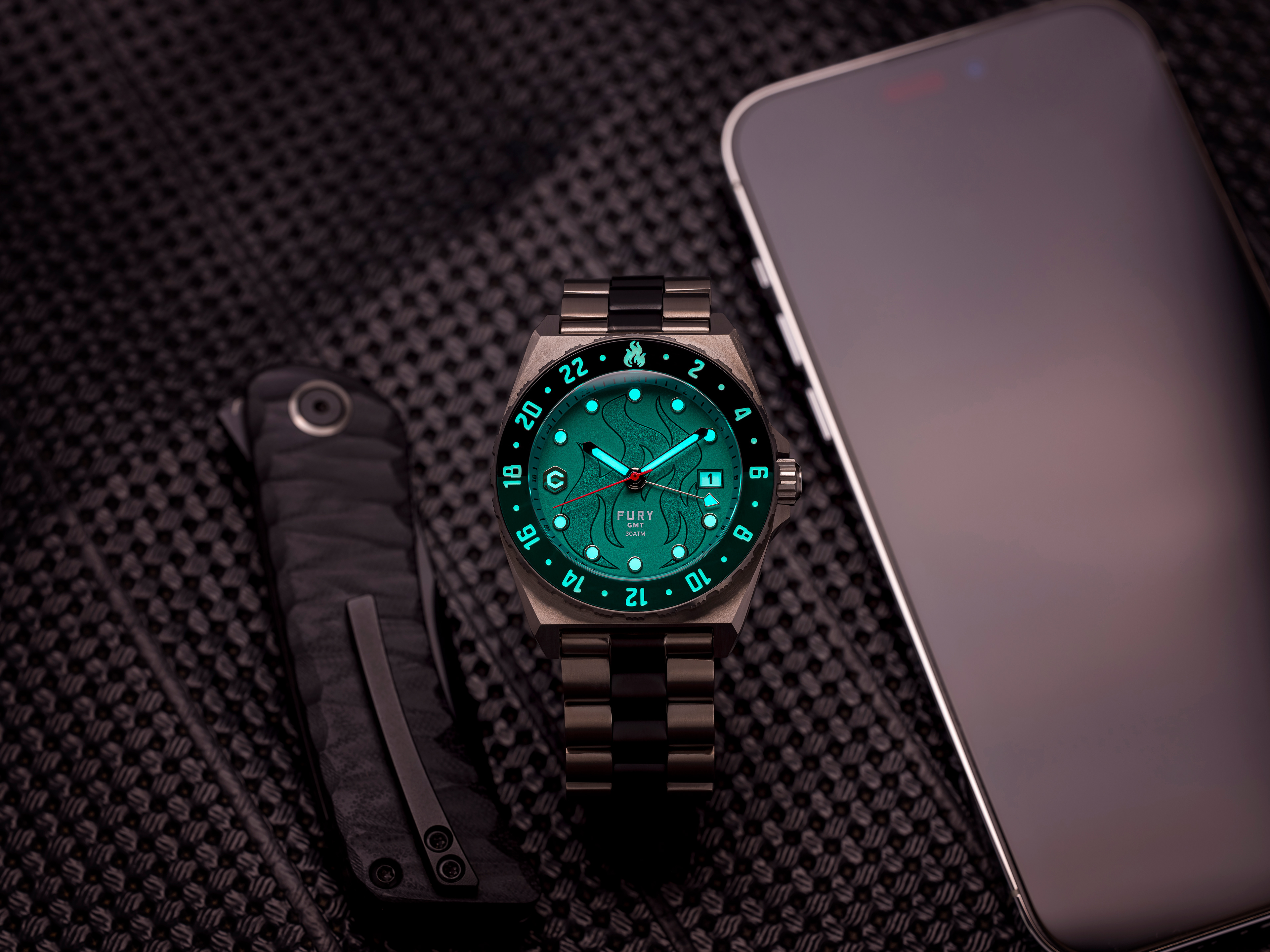
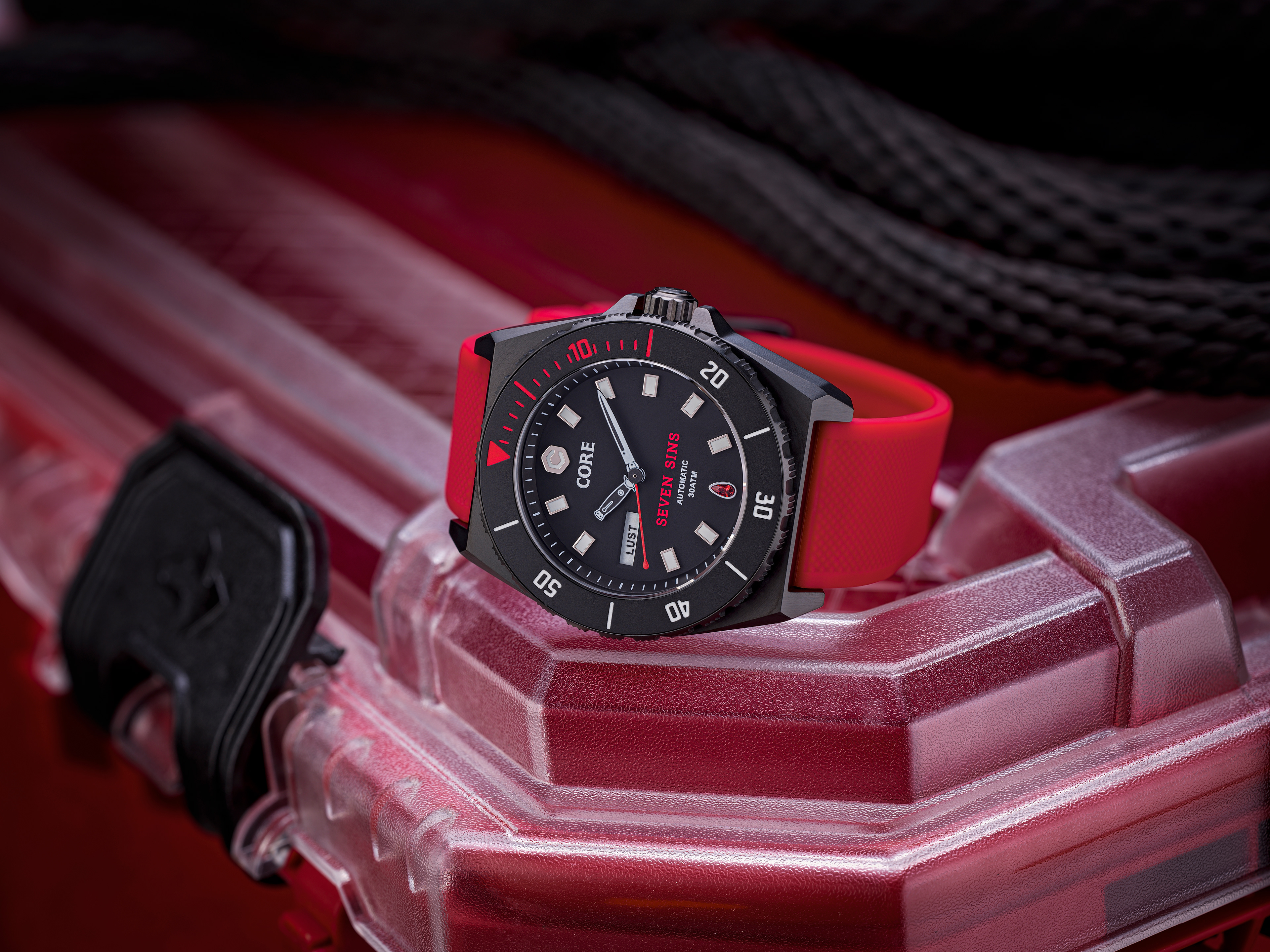
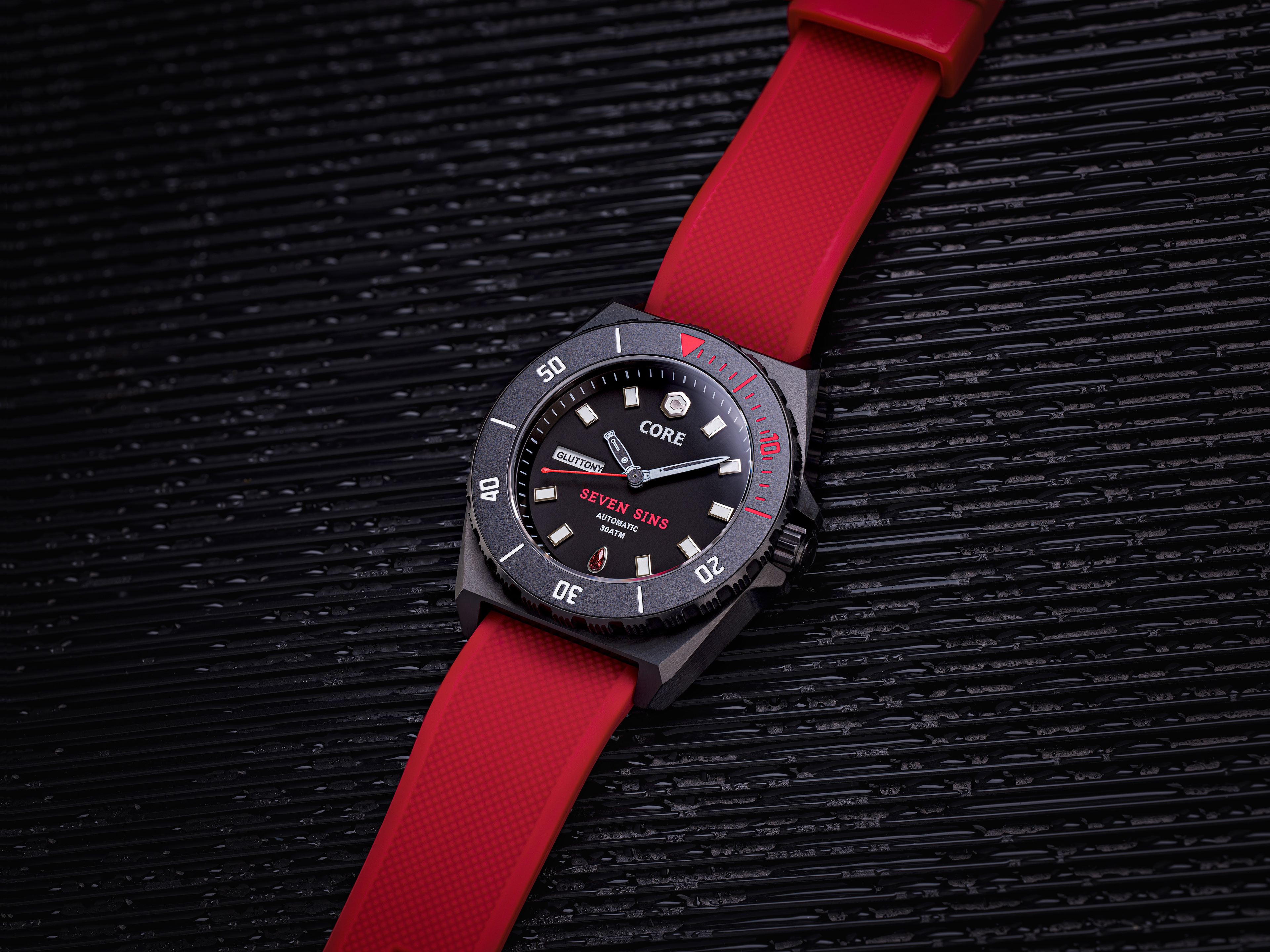
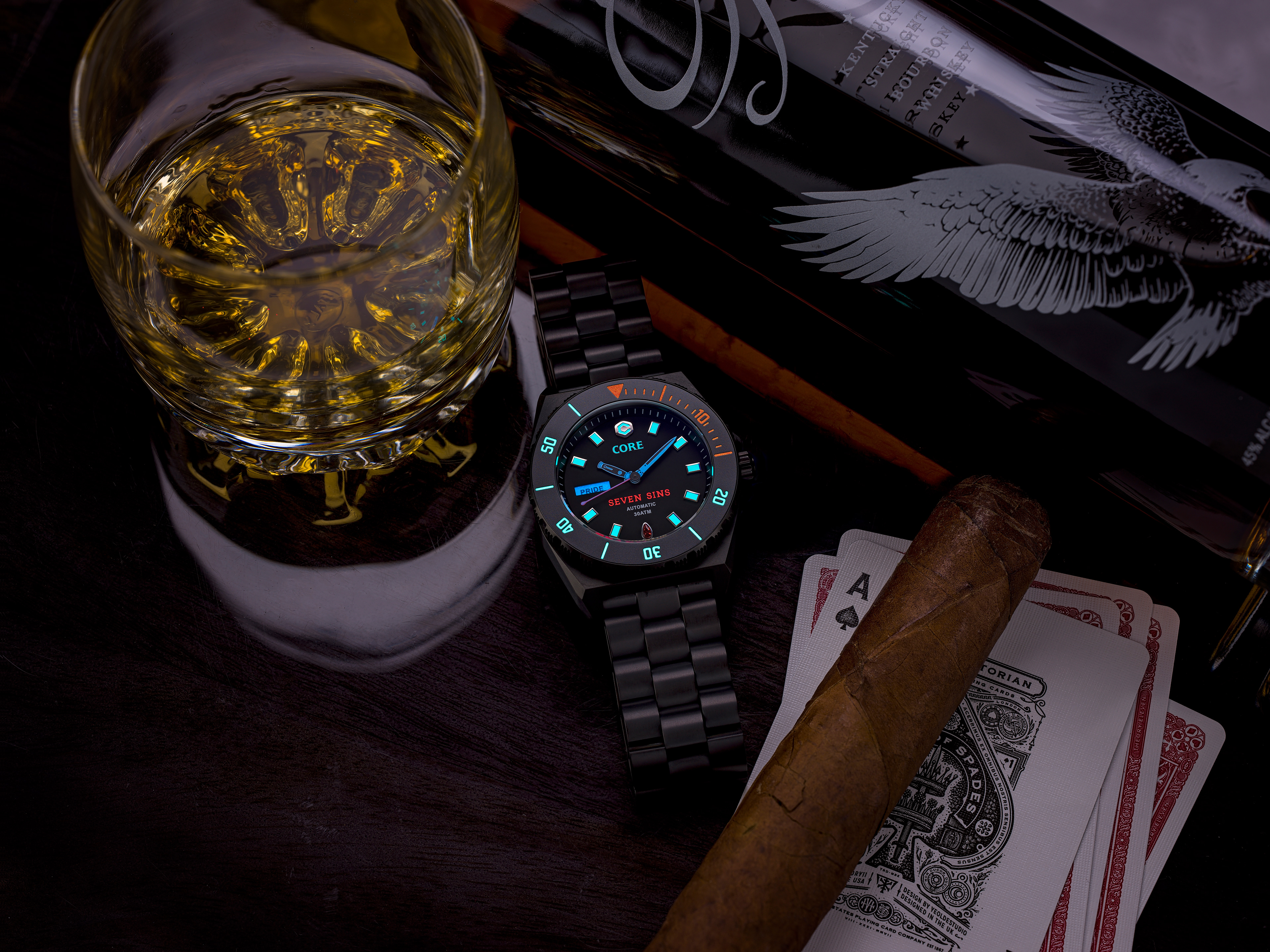
Imagery Style: Defined photography and mood guidelines with a focus on dramatic lighting, rich textures, and close-up details, emphasizing the artistry and material quality of the watches. Where marketing messages were being communicated I wanted a tongue-in-cheek approach to visuals echoing the owner's sense of not taking themselves too seriously and always finding humor in things.
Iconography: Designed a set of custom, minimalist icons to complement technical diagrams and digital interfaces, maintaining brand cohesion.
Packaging Design: Created a luxurious unboxing experience with materials like leather-textured paper, metallic accents, and multi-layered compartments for straps and accessories. Each box feels bespoke, enhancing the premium perception.
Digital Identity: Designed web and social media templates featuring clean layouts, bold typography, and imagery that highlights the product’s craftsmanship, attitude, and emotional appeal.
Marketing Collateral: Ensured all brochures, ads, and in-store displays consistently reflect the brand’s luxurious yet daring personality
Brand Touchpoints
Developed guidelines for all brand touchpoints, ensuring seamless integration of voice and visuals across the website, packaging, email campaigns, and social media.
Coordinated the rollout of the updated visual identity through targeted campaigns, unveiling the refined look to engage both existing customers and new audiences.
Focused on aligning every customer interaction with the brand’s promise of bold luxury and storytelling.
Retail Experience: Designed the in-store and live-event experiences to reflect the brand’s identity. This included display designs, posters, dining experiences, and customer service protocols.
