Drawing logo inspiration from Avellino's cultural heart means exploring its provincial seal and city flag using key iconography like the crown. Using simple typography fosters immediate recognition and ensures clarity across various sizes and platforms. Its clean aesthetic conveys professionalism and timelessness.
This straightforward approach ultimately enhances brand recall and strengthens overall visual communication.
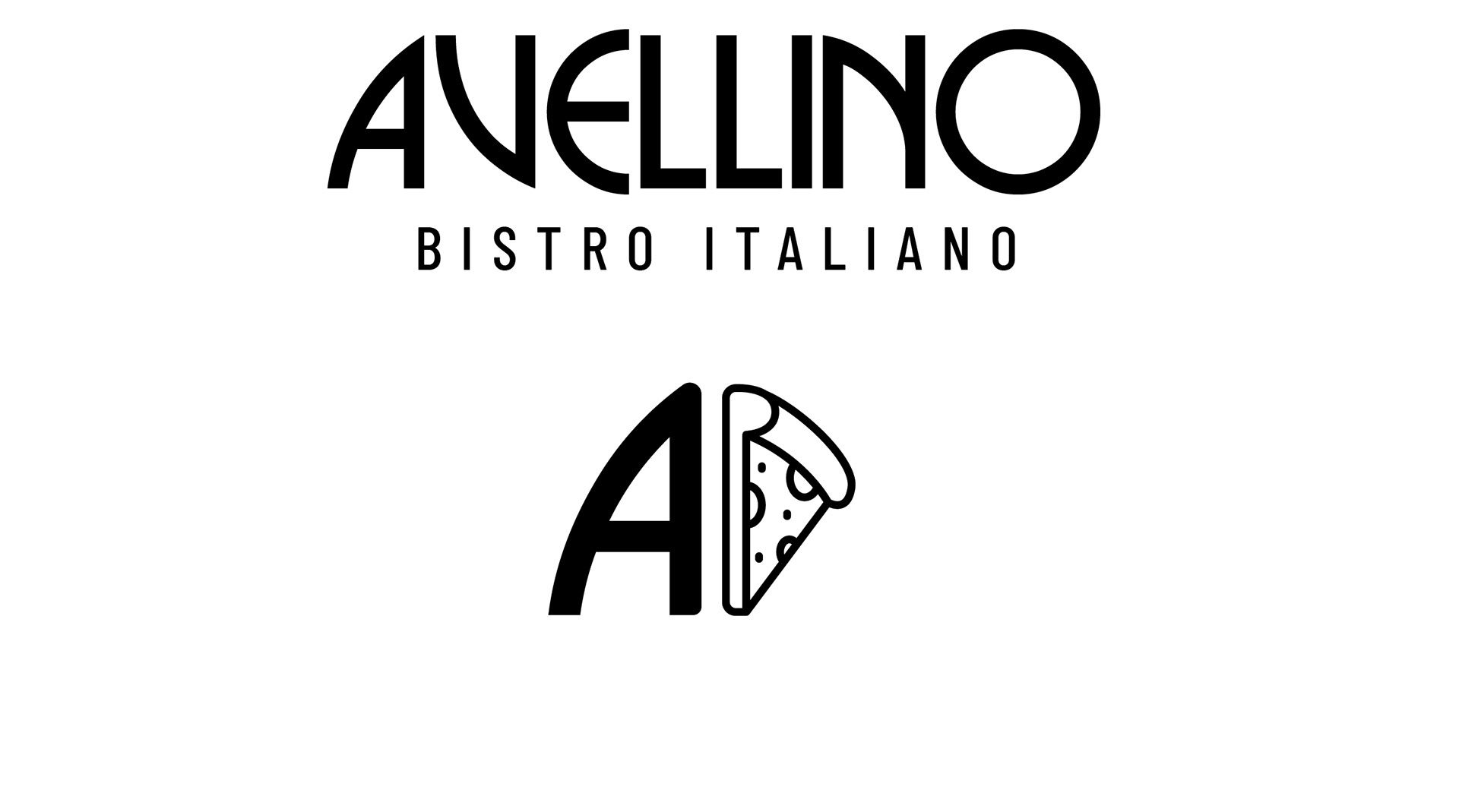
This version seeks to subtly weave together the restaurant's name, its Italian identity, and a contemporary aesthetic. The prominent, stylized "AVELLINO" lettering immediately grounds the brand in the shape of pizza. The choice of a clean, slightly geometric sans-serif font offers a modern feel while retaining legibility and a touch of Italian design sensibility.
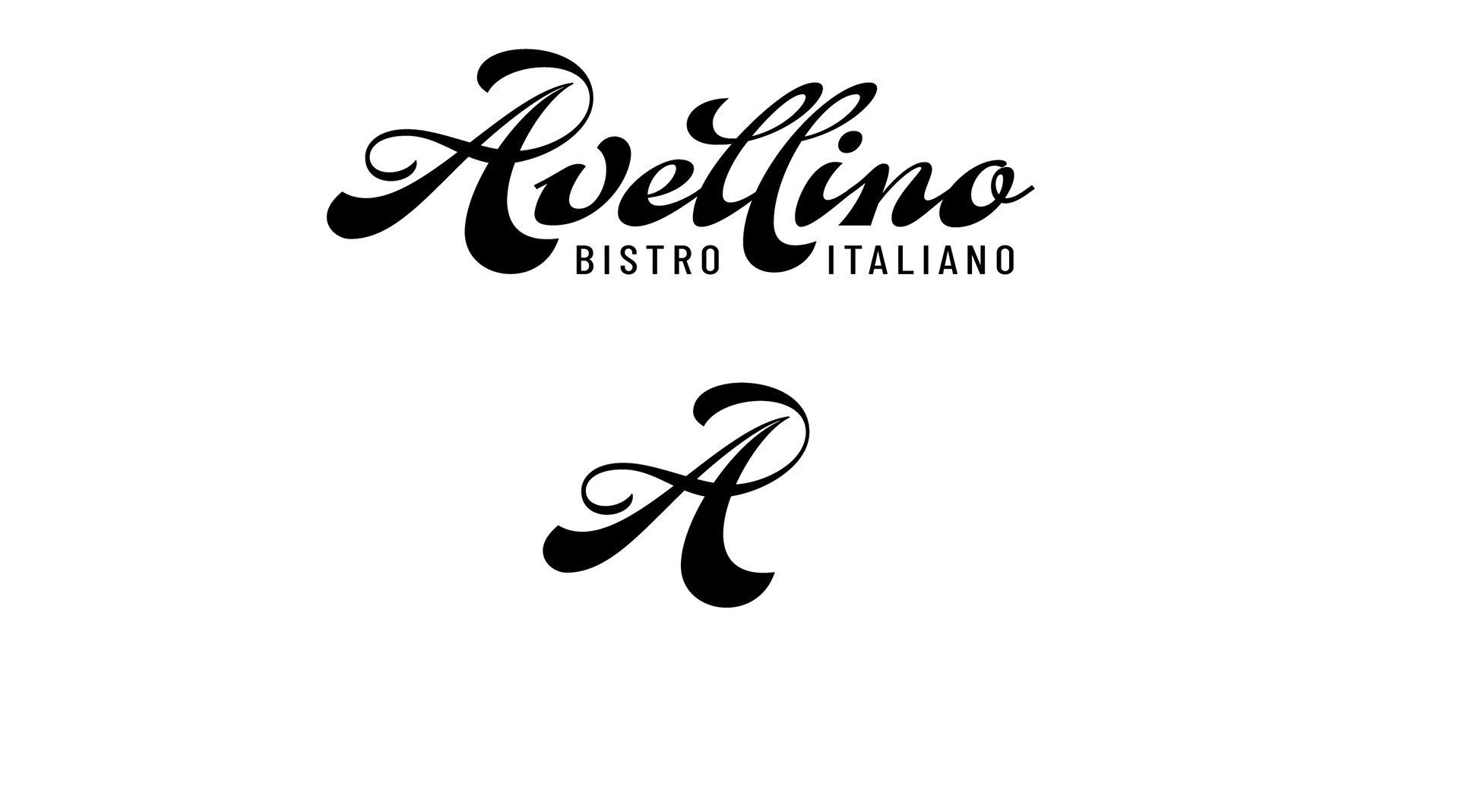
The flowing script of "Avellino" evokes classic Italian charm, directly referencing the city and the Chestnut trees flowing leaves. "Bistro Italiano" clearly states the cuisine. The stylized "A" offers a memorable, elegant initial. The design aims for a warm, traditional feel, connecting the Garden City location to authentic Italian heritage.
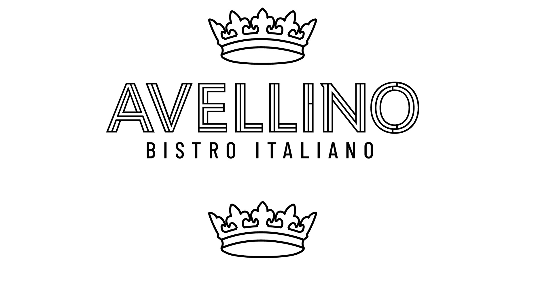
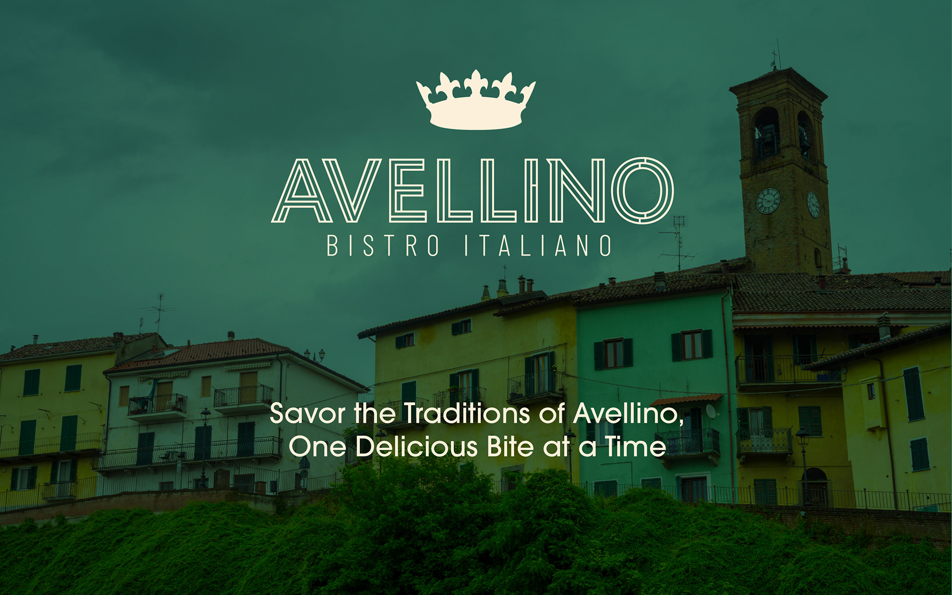
"AVELLINO" in a modern font links to the Italian city. "BISTRO ITALIANO" clarifies the offering. The crown adds a touch of elegance, hinting at quality and perhaps a nod to Avellino's history. Clean lines suggest a sophisticated yet approachable dining experience, honoring heritage with a contemporary feel.
The hand drawn font of "Avellino" has a warm, inviting vibe, perfect for a place where you can kick back, relax, and enjoy a slice. Each letter has a casual, hand-drawn feel, as if sketched quickly on a takeout menu. Think imperfect lines, a slightly bouncy baseline, and just enough character to make it memorable without being distracting. It's the kind of font that says, "Come on in, we've got delicious pizza waiting!"