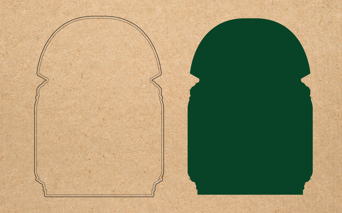
Inspired by the robust arches found in the corridors of Avellino's medieval castle, the content frame utilizes their strong, curved forms. Instead of outlining the arch directly, the negative space between the implied arches becomes the defining shape of the logo's border. This creates a subtle yet powerful visual echo of the region's architectural heritage, suggesting both strength and a sense of historical depth within a clean, modern aesthetic.
Finding Avellino's Heart in the Space Between.