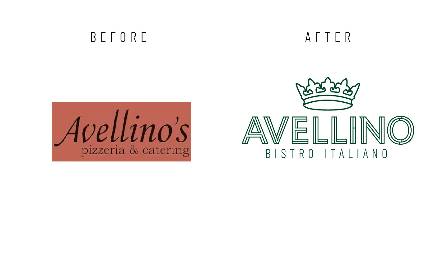
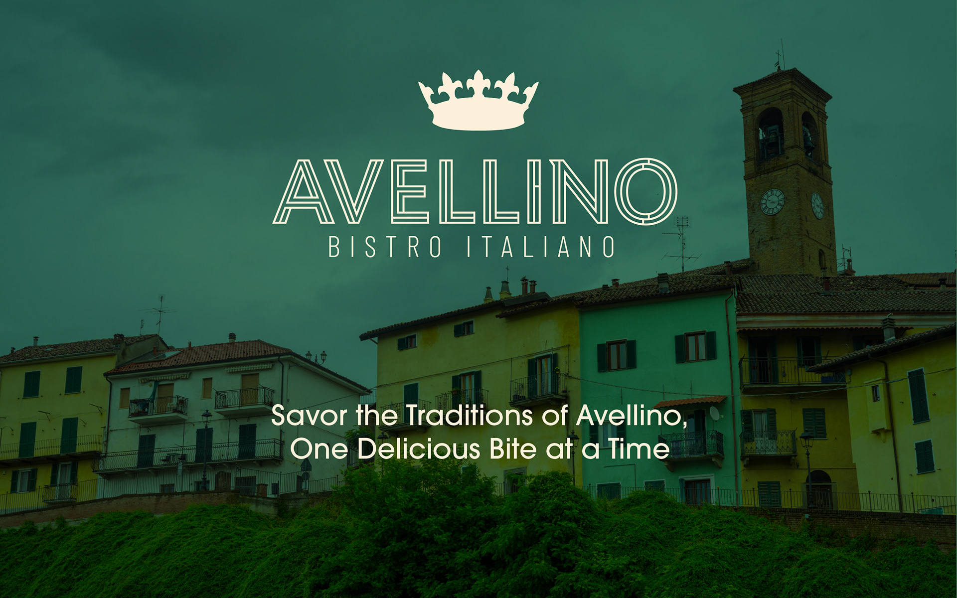
Here is a complete rebrand for Avellino Bistro Italiano a pizza establishment on Long Island. The goal was to elevate its image, appealing to a more sophisticated clientele while deeply embedding the owner's authentic Italian heritage. Inspired by the owner's hometown in Italy, the rebrand incorporates refined design elements, a sophisticated color palette, and elegant typography to reflect the rich culinary traditions and aesthetic of a truly authentic Italian experience. This project demonstrates a successful fusion of modern design principles with a genuine sense of place and history.
The name change isn’t about losing the past . . . it’s about refining it to meet the moment.
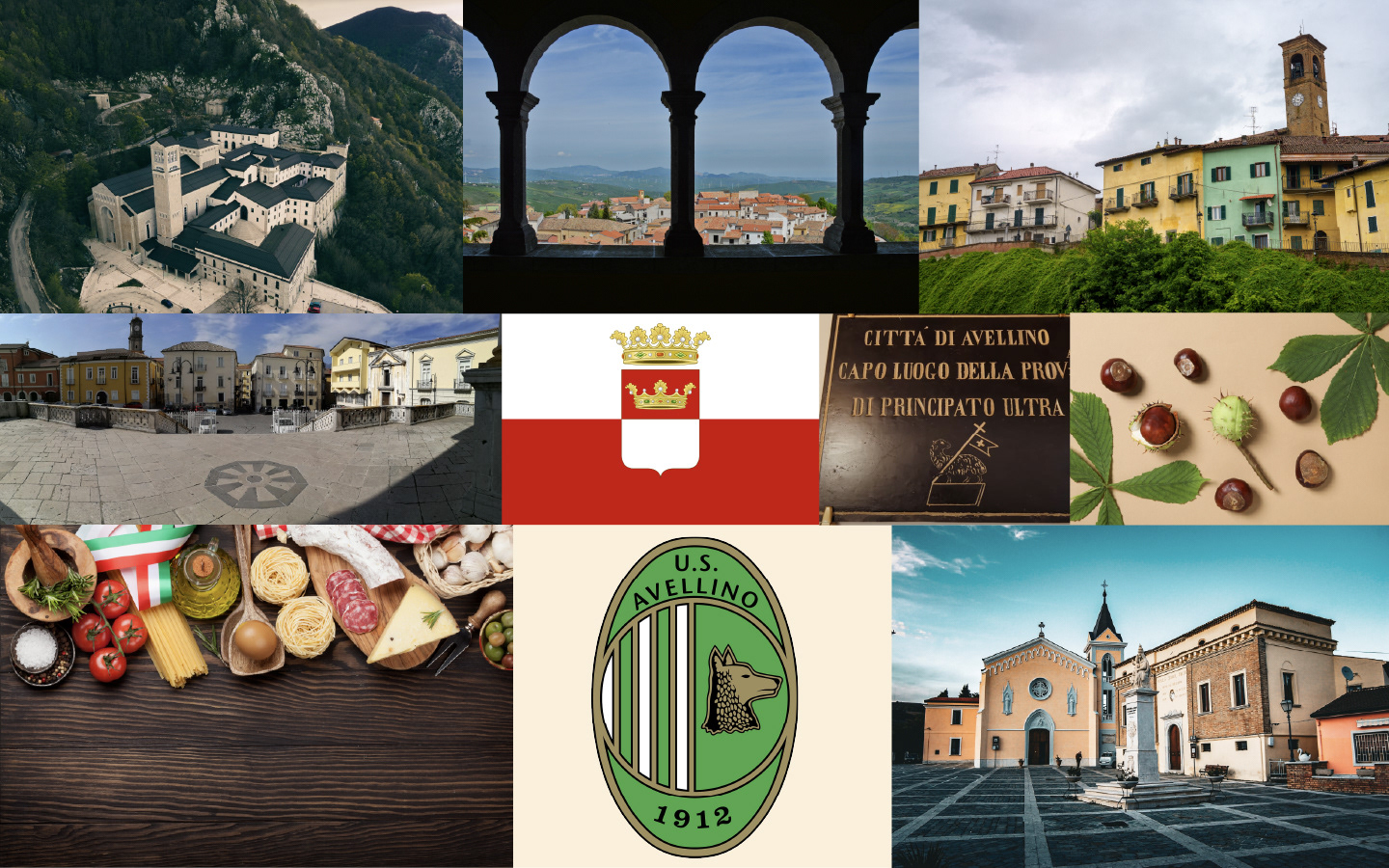
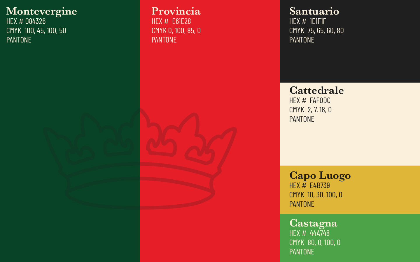
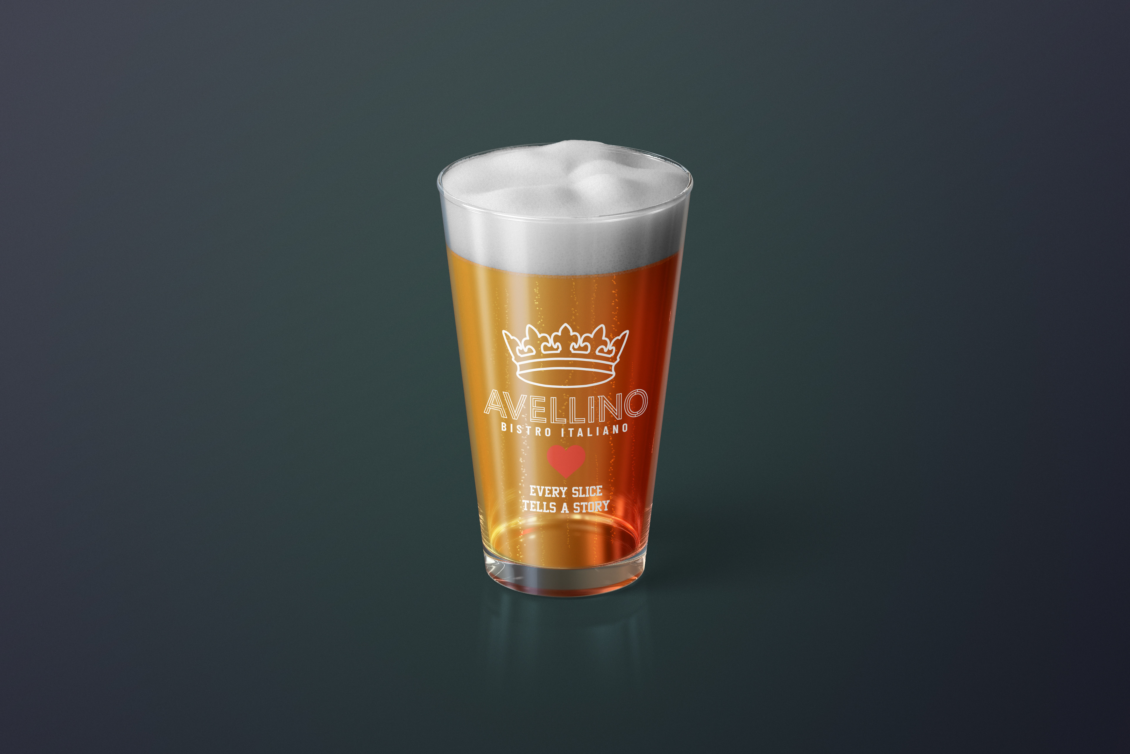
Taking Inspiration from the rich colors and culture of Avellino Italy, I created a color palette that is reminiscent of walking the city streets. Avellino's sun-drenched hills and rich agriculture inspire a warm, inviting palette. Think earthy ochre, vibrant tomato red, fresh chestnut green, and golden lemon yellow, balanced by a neutral ivory. This captures the region's authentic flavors and rustic charm
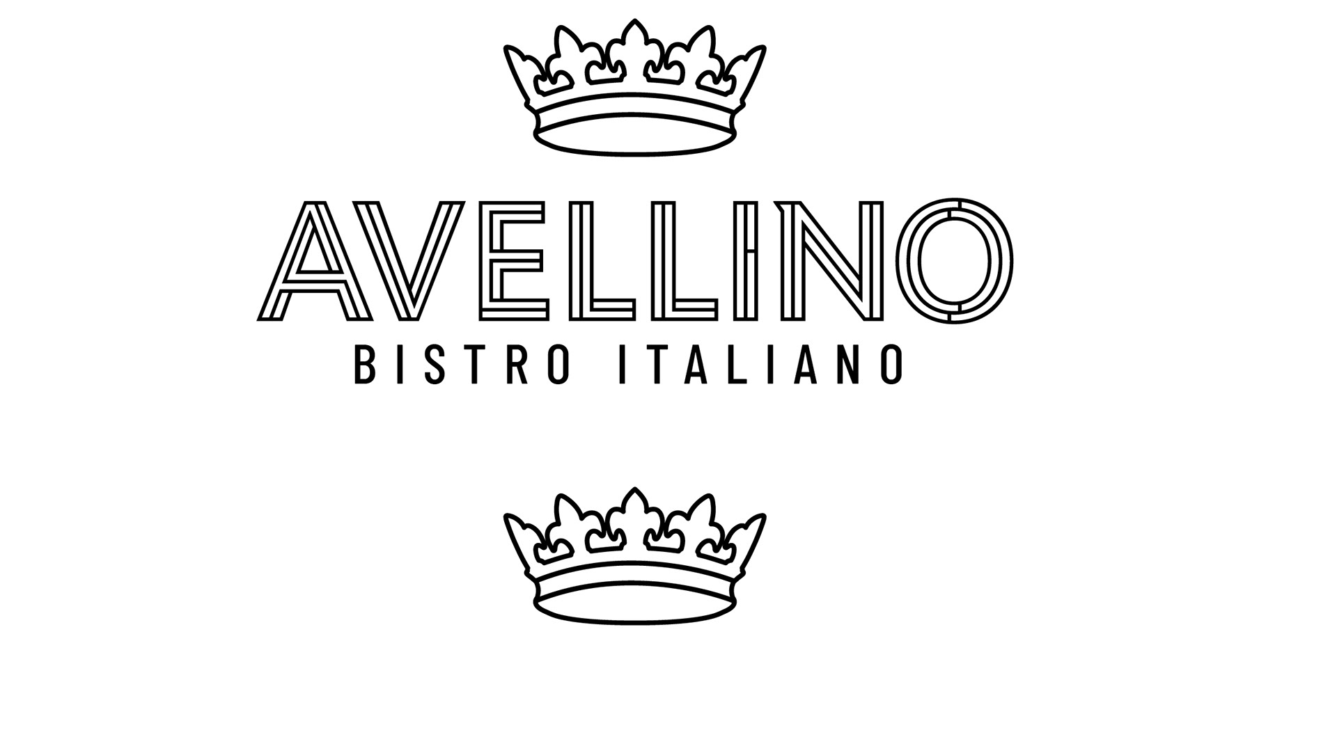
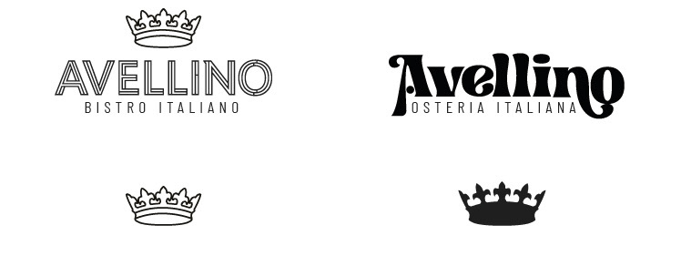
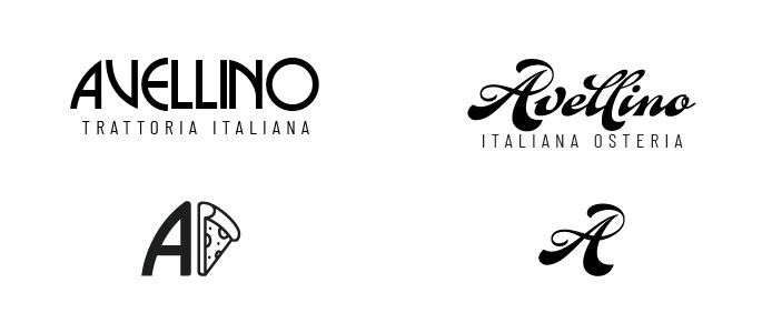
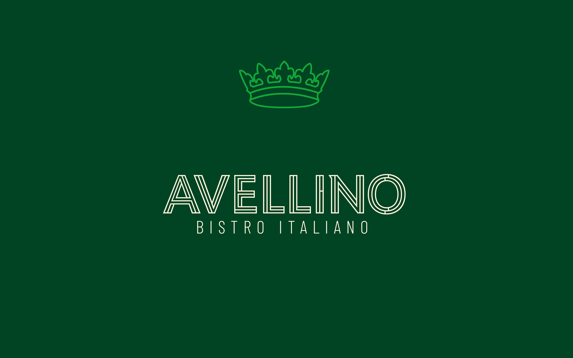
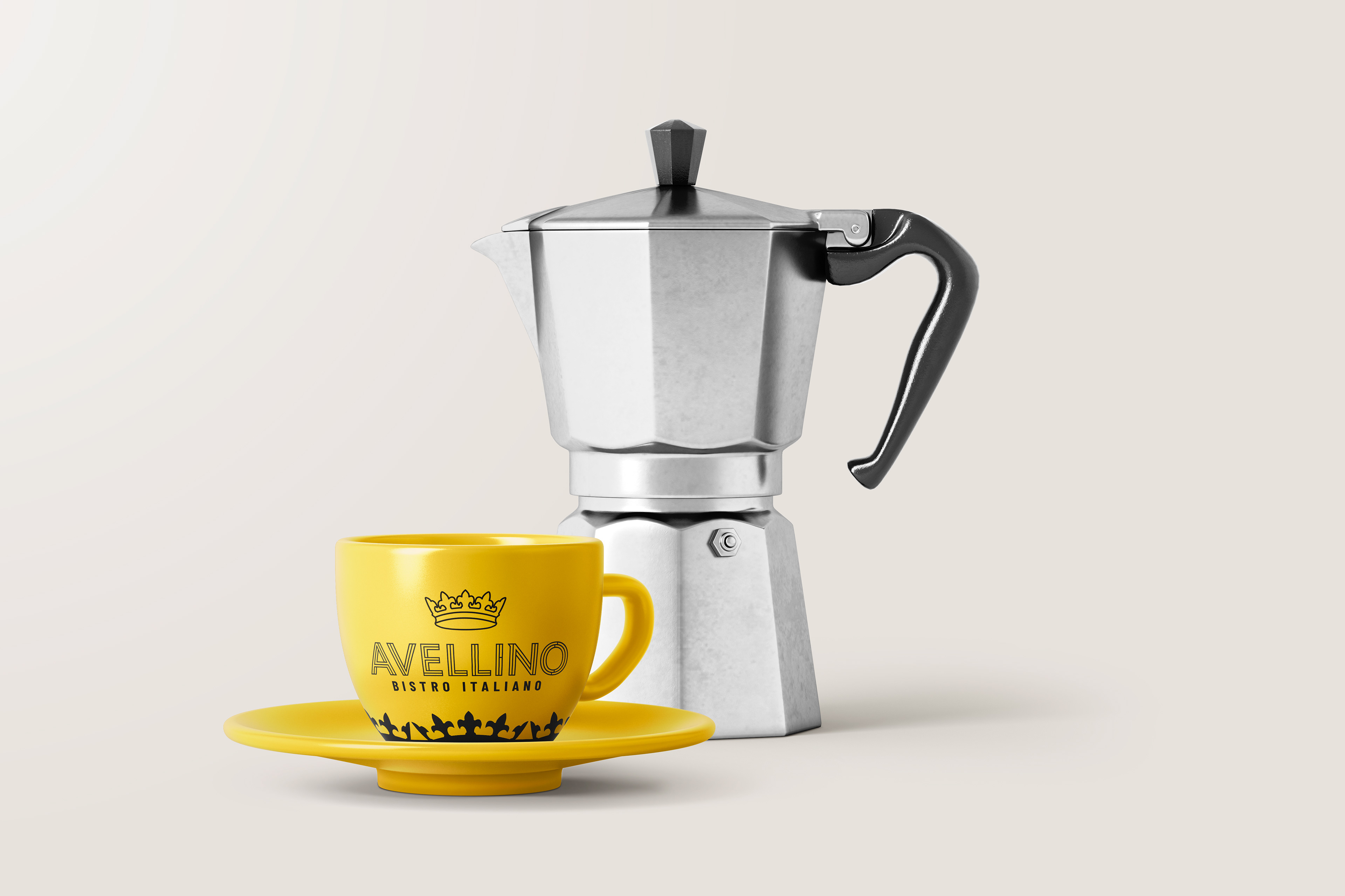
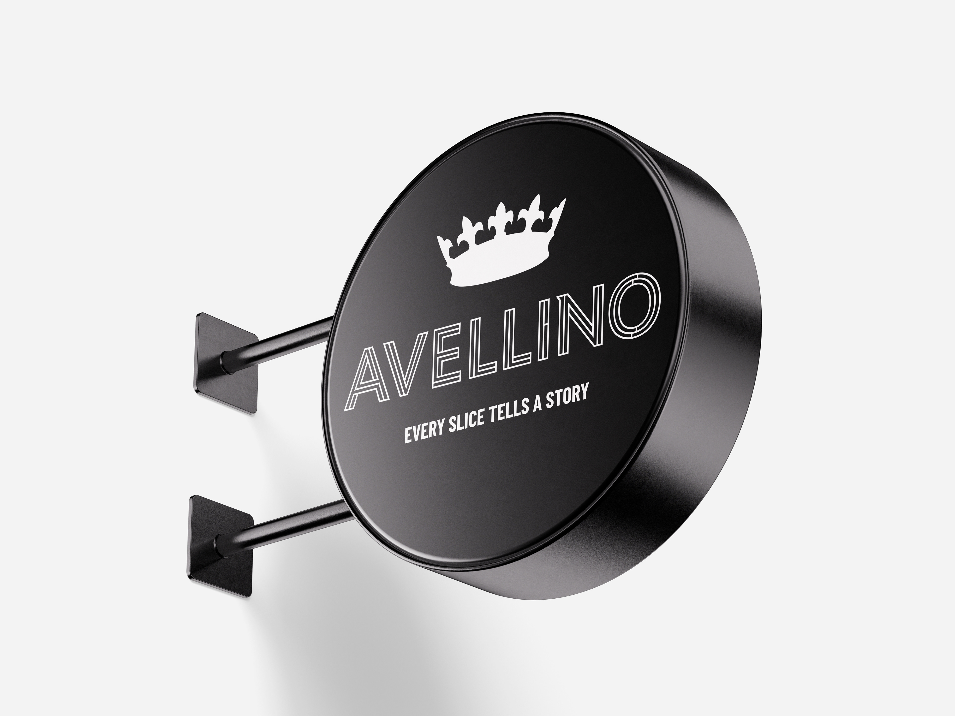
Logos
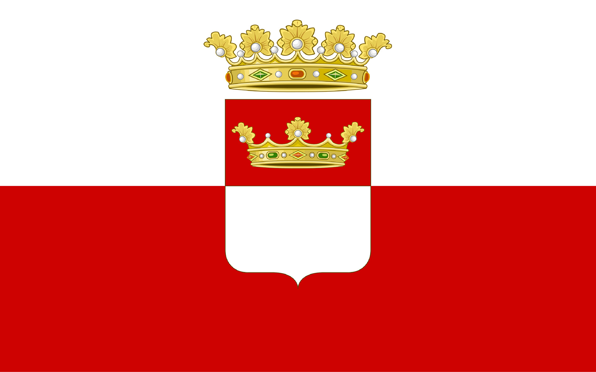
Drawing logo inspiration from Avellino's cultural heart means exploring its provincial seal and city flag using key iconography like the crown. Using simple typography fosters immediate recognition and ensures clarity across various sizes and platforms. Its clean aesthetic conveys professionalism and timelessness.
This straightforward approach ultimately enhances brand recall and strengthens overall visual communication.

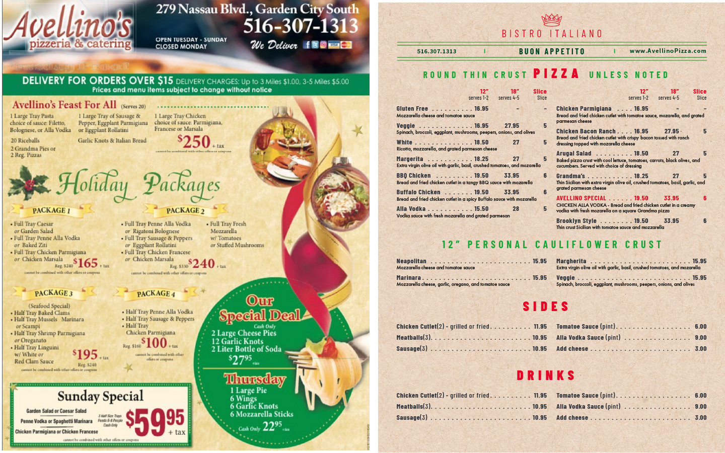
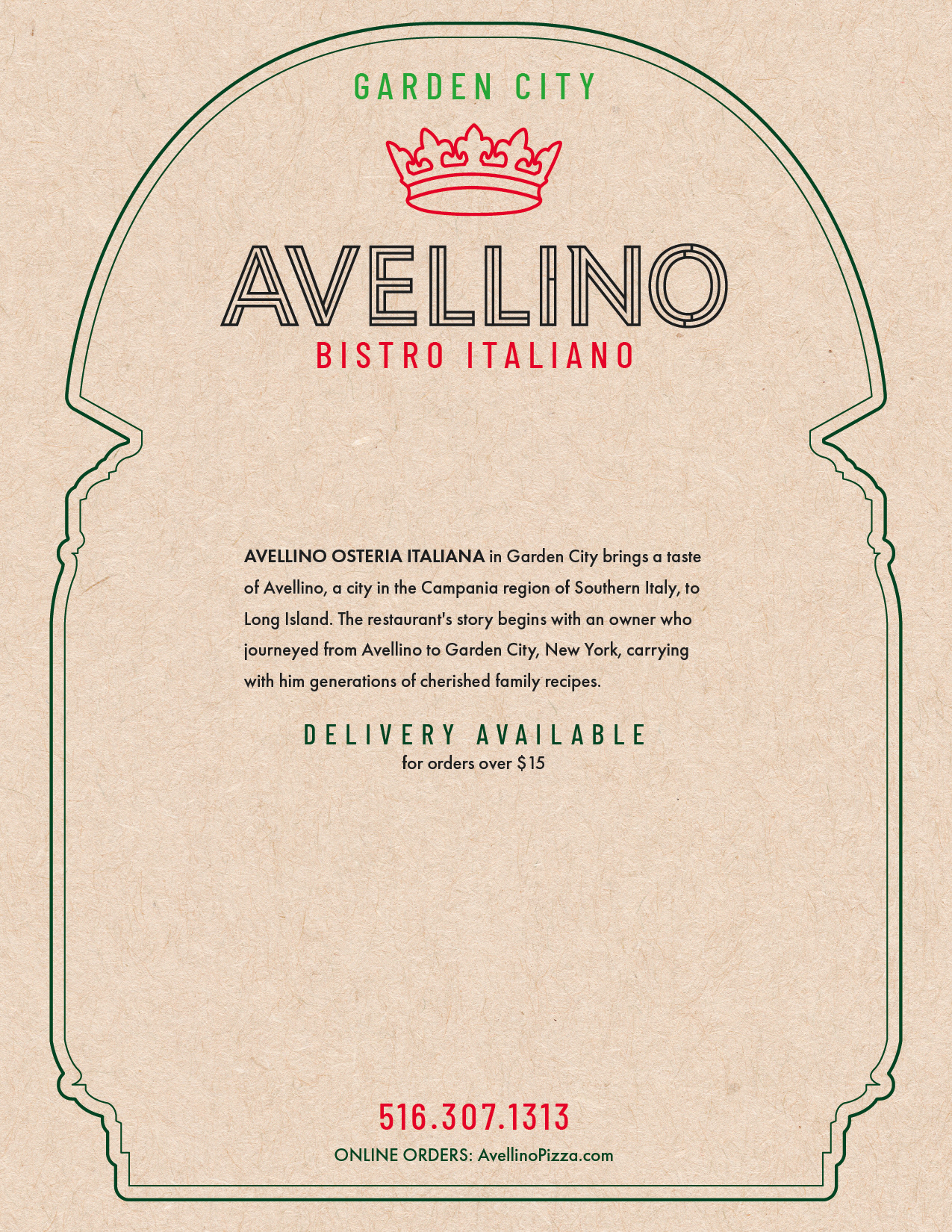
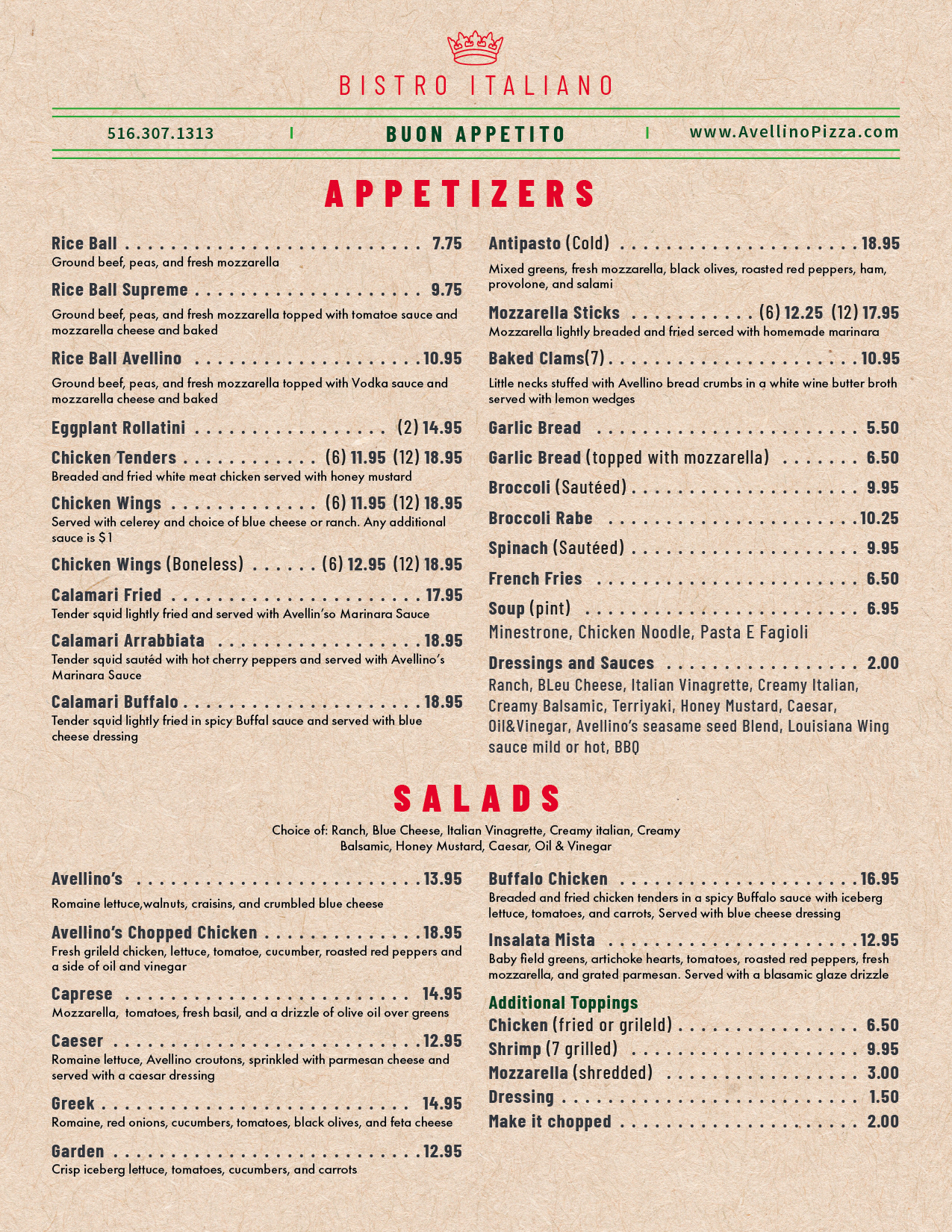
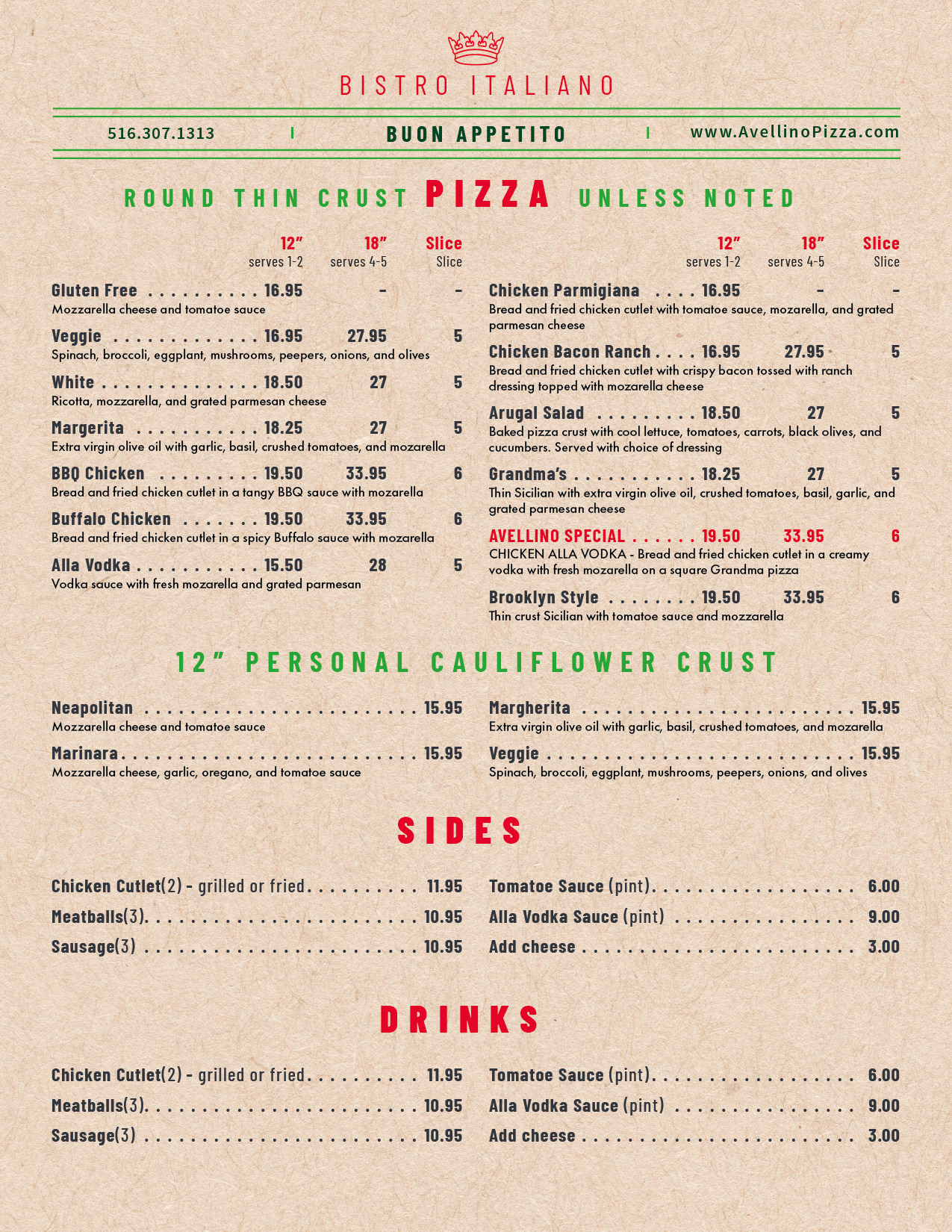
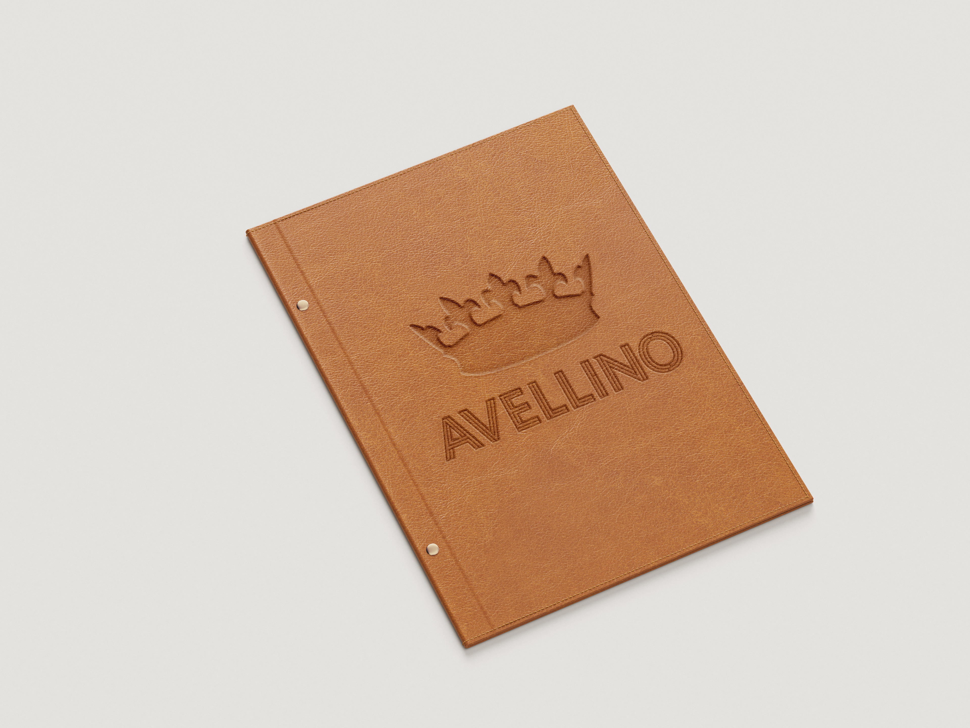
Menu Design
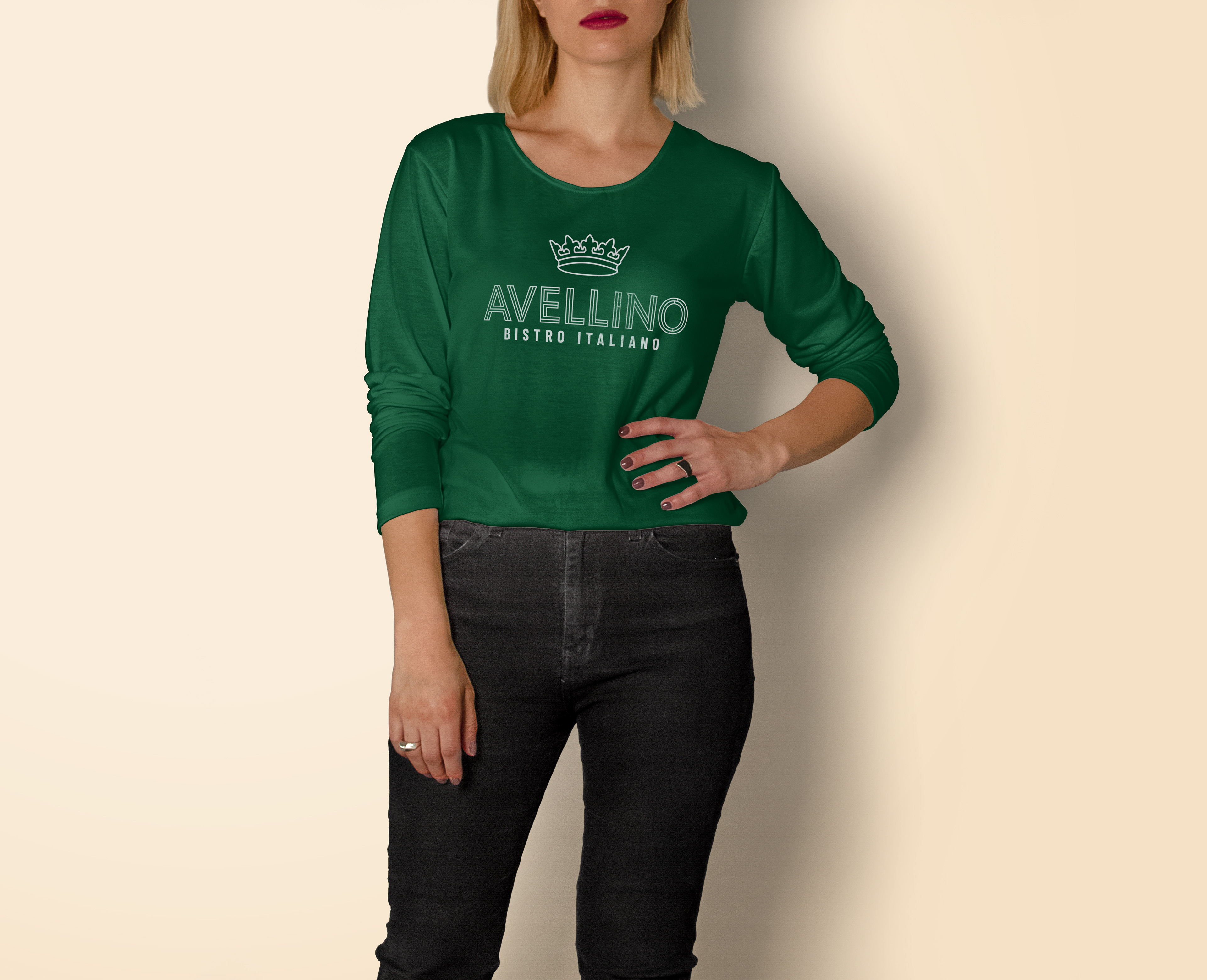
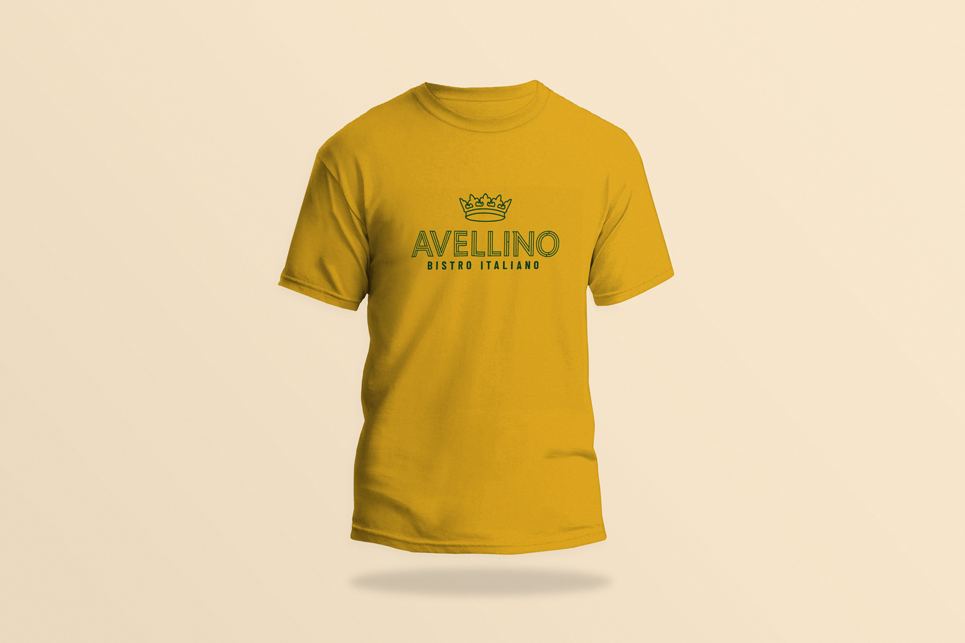
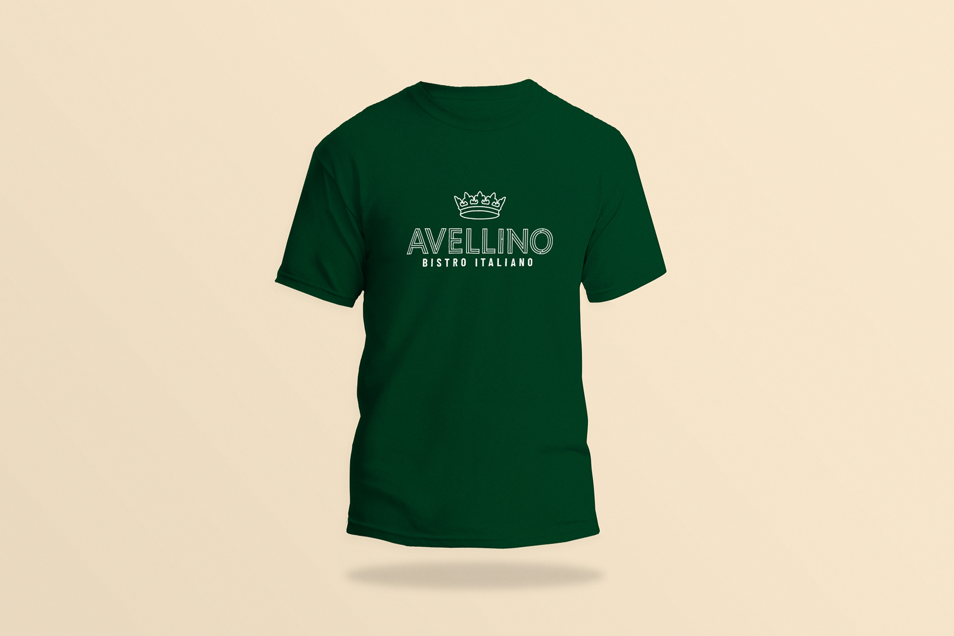
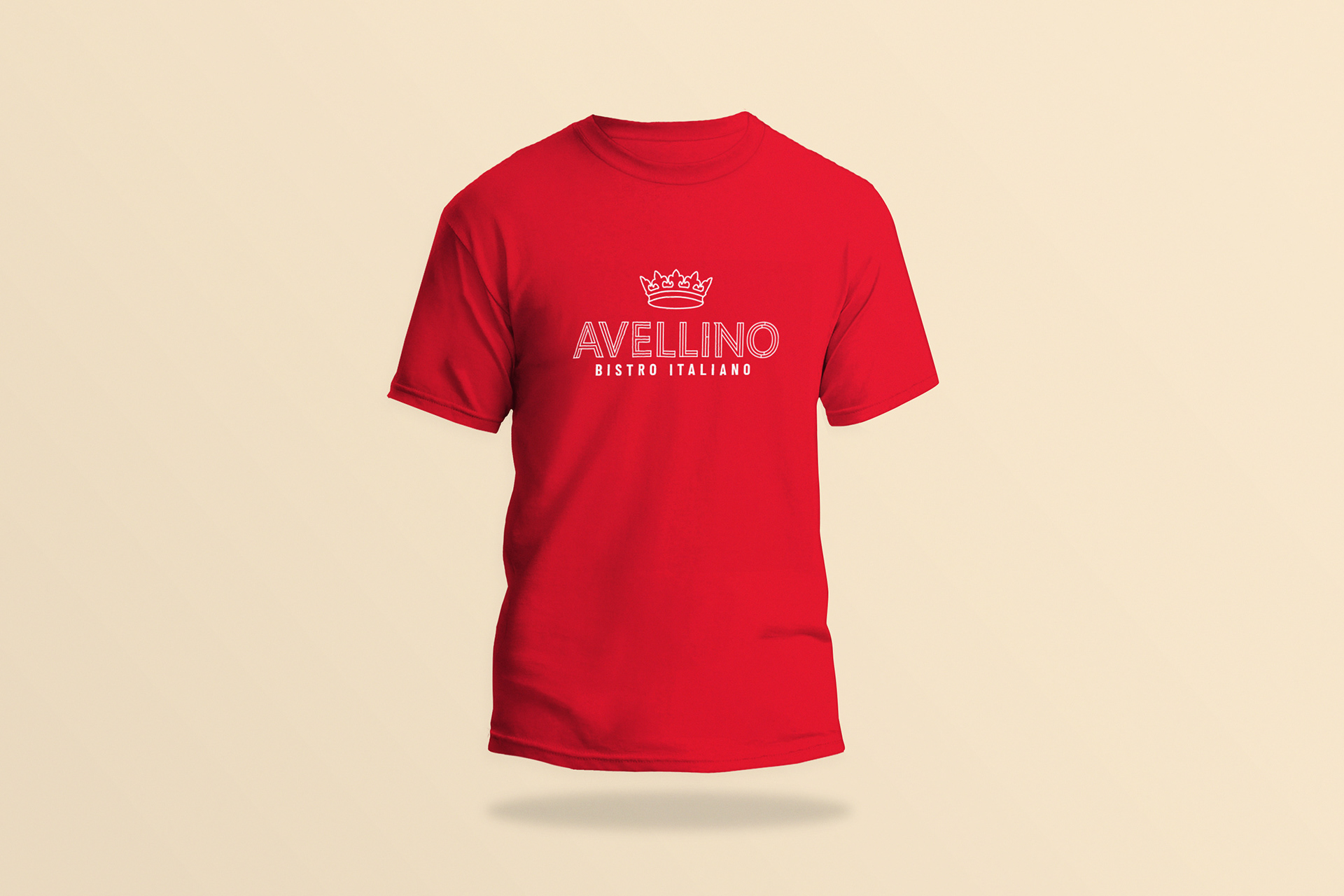
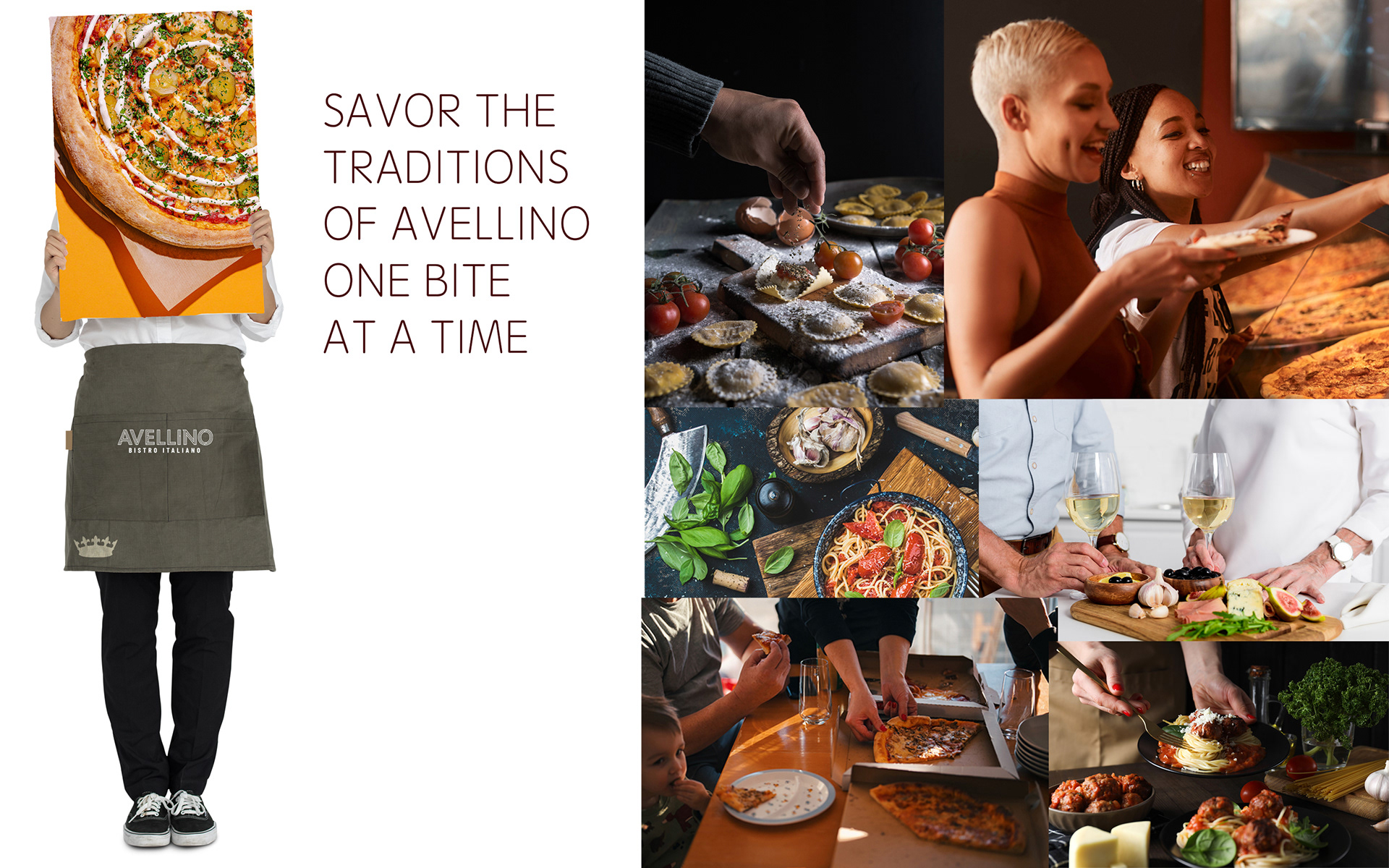
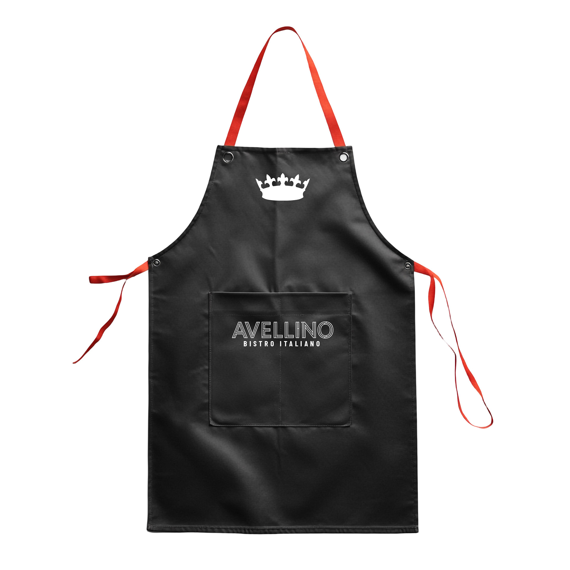
Apparel


Before & After